Monday, September 27, 2010
Modes of Appeal: Logos, Ethos, Pathos
ETHOS: Pedigree Plus wet dog food.
Type: There is a lot of information on this dog food can. The scale of it is good, but the lack of contrast between each fact is hard to read. The reader would have to take time to sit down and read every bit of that can to know exactly what they are getting and how should they serve it to their pet. Also, You don't know where the front and the back are. I'm not sure if this is due to image or type, but I feel like they are both at fault. Although, the Pedigree Plus logo I feel looks trustworthy due to the blue ribbon behind the name, which carries many connotations. Also, the way that they highlight the Healthy immunity is good whine the burgundy circle.
Color: The color is consistent with rest of their products. YELLOW and blue. Even though the blue ribbon can read trustworthy the yellow is a bit over bearing and could use some nice touches of other colors. Or maybe just less yellow and more blue or white. I feel they chose a good dog though for this can because he definitely stands out due to its coloring. If it were to be a blonde dog it would have blended in with the rest of the canvas.
Image: Choice of imagery is obvious. It's dog product, so why don't they have a dog on it. Nothing wrong with that. Also, they show what the food looks like in the can, and what it was made out of before it was processed. Image is not a main thing on this package due to all the typographic information that is needed to show why this can of dog for is good for your dogs immunity.
THE AUDIENCE: I believe that the audience of this product is a dog/pet owner that is concerned with what their dog is eating. Eating wet dog food is known to be a luxury so they also don't mind spending money for quality. Also to have a balanced diet.
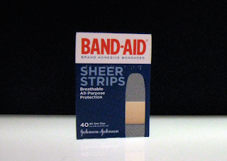
LOGOS: Johnson and Johnson Band-Aids
Type: The type on this package is is also a dominant element. It's clear and concise, which is totally obvious and I think smart. When looking for a band-aid you need to be able to see something clear and bold. Which this type does on the cover. The type on the back is small and the user I feel can choose to read this or not due to the simplicity of the box and obvious product. But the reason is is because there is no hierarchy on the back of the box like the front.
Color: the color of the type is bold, but the rest is very calming and plain, this could be due to the being in a slight accident no one wants to see crazy colors to just get them more confused.
Image: Image I feel is half of this packaging, because there is a big band-aid on the front, which tells the user look what is inside me! Even though the band-aid is not percentage wise a dominant image, I still feel it takes up half of this packaging conceptually.
THE AUDIENCE: This consumer of this product is a practical buyer who knows that these band-aids are better than the others to choose from. The audience I believe is everyone.
PATHOS: Wonka Fun Dip
Type: The type on this piece is obviously very playful and loud. There is a lot going on, and the hierarchy is a bit confusing. We know that it's Fun Dip, but the rest of the type is bit confusing due to them all being very similar sizes. Also, the Logo type is almost as dominant as the Product type. The type on the back is expressive and fun. I feel that it's pretty clear about what I'm supposed to read and in order as well.
Color: The colors are really everywhere. Due to it being a three flavor candy it helps that the three colors you get in the package are everywhere, but it is overwhelming and it's hard to read because the balance is too similar across the page. The percentage of the colors are almost equal. It was smart putting the type in white because of all the business with color.
Image: The imagery involved is very small, unless could fizzy little circles as imagery. But they do use the fruit to show what flavor each package contains. Even though it's not real fruit, but they elude to the taste of each one. The expressive swirls and circles show that it's a fun and free type of candy. Also it shows how you're suppose to use the candy but the "lik-a-stix" on the package which is helpful for someone who doesn't know how to eat this candy. On the back it really expresses the "Wonka" feeling with the hat and the swirls as well.
THE AUDIENCE: This product I feel especially appeals to children. A child who enjoys to have a long sugary snack that will last. I'm not sure if appeals to parents because it tends to make quite the mess.
Subscribe to:
Post Comments (Atom)


No comments:
Post a Comment