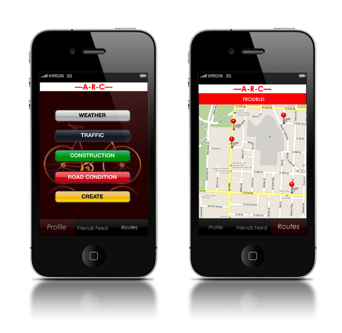
Moving forward with the design approach I made all the screens that were needed, but I plan on adding a few more to expand the scenario out more.
some feedback that was said in critique:
-consider a texture or pattern to put in the top bar.
-Look for a way to go back in the app.
-Don't necessarily need the age, maybe something more of what they are in the bike community.
-take the word "image" out
-Make the image bleed off the page.
-Make the type a bit more thick.
-Show examples of the other icons that would come up except for the car.
-watch craft.
-add some photos to the scenario
-add some type to the icons
-what happens when you click on a button that doesn't have a warning on it.
-work a bit more on the icons.
Showing posts with label IA. Show all posts
Friday, April 29, 2011
Friday, April 22, 2011
IA: Visual Direction iphone app
Moving forward with a mixture of two of the previous visual directions I decided to keep the color bright, but the same family. Overall I enjoy this first one the best, I'm just not so sure how well a bike wheel is being portrayed in the buttons. I tried some other ways, in the background, or up in the header as well.
Keeping it still very simple due to the nature of the app, it's an on the go kind of thing...they could very possibly be using it while on their bikes.
IA: iphone/touch design approaches
For this first approach I kept a very similar look to google maps and the apple aesthetic. I used a picture for the background to keep it simple and clear the app was about bikes.
Possibly adding more red in could be an option...
Moving on to the next design approach (while I moved into illustrator), here I wanted to keep the bright colors that they would want to see clearly. Also increasing the size of the buttons I though would be good, incase they were on their bikes multi-tasking.
In the last approach I wanted to simplify the map to it's core. So that if they wanted to push on a certain location, or zoom in on one it'd be clear and easy.
Keeping the colors still bright and fun with a touch of somewhat pattern.
I'm not so sure about the type on the first frame, or if that could even be possible, or legible.
On this one it just has a more simple vector feel compared to the one above which as an image of a wheel with vector shapes on top of it.
I chose the name "ARC" for Alternative route checker. I'm not sold, but I do like the way it looks typographically, as well as it being nice and short.
Possibly adding more red in could be an option...
Moving on to the next design approach (while I moved into illustrator), here I wanted to keep the bright colors that they would want to see clearly. Also increasing the size of the buttons I though would be good, incase they were on their bikes multi-tasking.
In the last approach I wanted to simplify the map to it's core. So that if they wanted to push on a certain location, or zoom in on one it'd be clear and easy.
Keeping the colors still bright and fun with a touch of somewhat pattern.
I'm not so sure about the type on the first frame, or if that could even be possible, or legible.
On this one it just has a more simple vector feel compared to the one above which as an image of a wheel with vector shapes on top of it.
I chose the name "ARC" for Alternative route checker. I'm not sold, but I do like the way it looks typographically, as well as it being nice and short.
Thursday, April 21, 2011
IA: Wire Frame Scenario Choice
After basically combining my three scenarios together, I came out with this!
I'm pretty excited to get started on this project to be honest, designing for something other than a traditional computer screen, and something that everyone could potentially use is interesting to me.
Over all the scenario starts out with a loading/introduction page, then you can either enter in your potential destination, or go to a saved destination to see if there are any problems in those routes.
Next after seeing the warning sign on slide #4 they will click on the problem that is going on and then the map will come up showing all the problems on the map. You can either swipe through, or someone suggested that I connect with google maps and just have all the selections on one screen, then they can zoom in on the problem and see user feedback, with images and comments about the problem area. I would think that each of these users would be rated on their posts, and how realistic they are, while also the area that is being investigated is rated as well, such as if it's a tough area versus something you can probably ride through.
Over all I just want the bike commuter sub culture to have a tool to use to communicate with eachother about problems they come across, as well as connecting to the news and weather stations to see when a good time is to take a bus or completely avoid a car wreck.
I'm pretty excited to get started on this project to be honest, designing for something other than a traditional computer screen, and something that everyone could potentially use is interesting to me.
Over all the scenario starts out with a loading/introduction page, then you can either enter in your potential destination, or go to a saved destination to see if there are any problems in those routes.
Next after seeing the warning sign on slide #4 they will click on the problem that is going on and then the map will come up showing all the problems on the map. You can either swipe through, or someone suggested that I connect with google maps and just have all the selections on one screen, then they can zoom in on the problem and see user feedback, with images and comments about the problem area. I would think that each of these users would be rated on their posts, and how realistic they are, while also the area that is being investigated is rated as well, such as if it's a tough area versus something you can probably ride through.
Over all I just want the bike commuter sub culture to have a tool to use to communicate with eachother about problems they come across, as well as connecting to the news and weather stations to see when a good time is to take a bus or completely avoid a car wreck.
Tuesday, April 19, 2011
IA: Final Barbie Website
Finalizing the website I came upon some problems with the coding, but finally got it to work.
Overall the Barbie website was to show how I felt about Barbie, and yes, I probably could have shown that a bit better. I kind of regret not working harder on "The Girl" section to really show my frustrations with the brand and what it stands for. Also, the information graphics I feel were also hurting a bit, I think I was just expecting them to be a bit more developed, or more detailed or something I can't think of.
I'm definitely happy with the over all look of the website though. Changing the colors I think really helped me out with where my point of view stands. Also the barcode shows the idea of consumerism and barbie play together.
IA: Icons and Gestures
The readings were enlightening, and it was nice to see the basic break down of the two elements that the iphone/touch entail.
five points from the readings
*Keep the gestures simple.
*Provide good feedback to users their gestures are being recognized.
*Make sure all icons are standard so nothing looks too out of place.
*You can have multiple icons for one action.
*Make sure to have enough space to function properly.
five points from the readings
*Keep the gestures simple.
*Provide good feedback to users their gestures are being recognized.
*Make sure all icons are standard so nothing looks too out of place.
*You can have multiple icons for one action.
*Make sure to have enough space to function properly.
Monday, April 18, 2011
IA: Project 3 Brief: KC Bike Commuter's Tailored iphone app
Picking out an iphone app to design I went with the one that addresses the problem of bad traffic, and weather concerns. While including a sense of community, I'll be bringing in the feature of friend alerting one another of things on the road to look out for.
AUDIENCE: Kansas City Bike commuters
PROBLEM and SOLUTION: Finding the right route is difficult, especially if there are problems on your main one, so my app will show bike commuters different ways they can go around those problem areas such as: weather, traffic, construction, or road problems like a pot hole or gravel roads.
Monday, April 4, 2011
IA: updated barbie aesthetic
Still getting the header part down. Incorporated the barcode in other areas may be the answer. Definitely a more dark, gothic look at barbie.
Sunday, April 3, 2011
INFO ARCH: Barbie website, without corrections
I still have a lot of correcting, which is what I'm working on as we speak, but I'm adding some more edgy-ness and just better typography across the board. Flashy flash is getting there as well.
Monday, March 7, 2011
Subscribe to:
Posts (Atom)