Tuesday, May 11, 2010

I can't wait...

I can't wait until I have the money to spend on stuff like this:

http://www.catsletnothingdarkentheirroar.com/thecalendar.html

Saturday, May 8, 2010

Semester reflection: kind of off base.

Coming to an end within the second semester at the KCAI graphic design department it has definitely been a trip (like I said earlier). I know coming into this department I was warned of the workload, and the intense scheduling. And the warnings were valid, I especially know this coming to an end of this year. I felt that this year I have grown as a designer in a way I never thought I would before. I never thought to myself when I was in high school, "oh, I want to do design". NEVER did that come up. I don't even really know how I came upon the idea of wanting to be apart of this world. I was always so wrapped up within black and white film photography. (I'm getting off base, sorry) BUT, what I was getting at was the idea of how far I have come as a person within the department. I've been tested in many ways. Especially questioning myself for why I'm doing what I'm doing, and what I'm putting myself through. All the loss sleep and slight anxiety attacks the night before a critique I sometimes question if this is worth what I'm going to end up doing with my life.

Anyways, for the most part I have discovered a lot of new things that I think have always interested me, just never knew what they were really. Such as the idea of having a narrative within my work, I think looking back at all the work I've done throughout my life it has always involved a narrative. It's always been something I've been interested in, just never had a word for it, or that connection. Another thing I've noticed that I do is comment slightly on social issues within the narrative I've played with. Especially in my museum exhibit, and dot book that I did at the beginning of the year. It's becoming this idea of feminism that I've never really FULLY explored. And I really enjoy the idea of moving deeper within a subject and finding a conceptual way to ironically tie two different elements together.

I'm not sure if this is the idea of "semester reflection" that we were supposed to do, but I feel that when I do think about my semester and year as a full I've learned, and discovered new ideas, and new theories to base my design off of now. To take it to the next level, because I'd like to take it to the next level, but also keep myself within the next level.

Linear Process: Pattern/ Combinations/ Museum exhibit

Starting out with making patterns with our icons, trying to comment on how they would work with a narrative background. More of a conceptual view. Such as my birds circling the ants.
With this step we explored the idea of anchorage and relay. Anchorage is an anchoring device used to pull a word closer to the real meaning behind it. Relay is a way to find a new way of looking at the word, changing the meaning of the main word, possibly taking it into a deeper meaning. After this process this is when I discovered and started exploring the idea of using my icon set in a different meaning, a meaning relating to mother's as if they are getting held down by the "man" of the relationship. My final conclusion came to using five of my icons to start a museum exhibit identity.

Wine would represent- relief for the women
The bird would represent her being trapped, or controled
The cloud would represent a conflict in the home
The poisoned apple with the worm in it would represent her being neglected
And finally the ant would represent her worshiping her fellow companion.

I wanted to add a point of irony to the idea of this exhibit. Having soft nice tones with negative things said about women, in such a sarcastic tone.


This was the next step of exploring three different ways with our idea. I still kept the the picnic idea, but using words represent actions that might happen within a problematic picnic (I didn't find this as interesting, maybe because I was bit burned out by the idea, but also on how much I explored the idea of the feminist one) After looking at everything it came to the decision of going with the idea of pattern and word with the mother's prerogative. Which I was happy with, because the idea of having image, word, and pattern was a lot to handle to make look cohesive as a set.

After this crit there was still some corrections to be made:

And here we are now, I'm still making some tweaks here and there. I know I had a lot of trouble with how I dealt with the type within the title and Smithsonian logo, but hopefully I've battled it out enough.

Thursday, May 6, 2010

Museum exhibit identity: A mother's prerogative

A mother's prerogative came through my final icon set related to a problematic picnic. Going through one day working with Julie, we presented our icon set with words and images either relaying the message, or anchoring the message of the icon. I had one of my icon's, the attacking bird, with the word mother, which I feel is relaying the message of an attacking bird. So, this got me thinking, could I use the other icons in my set to send a relaying message from each of my icons. It took some more brainstorming to hammer the ideas out for each of my icons. I several different ideas, and a lot of them were leading up to a feminist idea of how the man can control the women, or how the stereotypical women is "supposed" to react to the stereotypical man. Such as the ants representing worshiping:
This idea lead to many more, but in the end the whole image with pattern, and showing the different women became inconsistent and then led me to the idea of just using one word with a pattern I had previously made, or remade for the idea.

I ended up using five out of seven icons to represent the mother's prerogative museum exhibit, and then paired them with five different words.

Ant=Worship
Bird=trapped and control
Wine glass= relief and cure
storm cloud=conflict
poisoned apple=neglect

I felt that all of these words and icons could relate back to how the wife was treated by her husband, or how possibly the mother could be treated by her kids, or how she could treat her kids.

I kept with my final icon color palette, but also by warming them up just a little to make them more cohesive as a set. Here the final product is. (I still have some revisions to make though)

YAY!

For the corrections to be made were to deal with the time based elements better than I am. Spread them across the board better, and to also fix the type again. Spread it out as well!

Image: Six degress final

Coming to the end of the last project in image class which was the six degrees project. It was fun, and interesting to have an issue brought to you, that you then had to solve with a partner. Which was the first time we all had to deal with having partners in the design department all the way through a project. It was nice not having the entire ordeal on your shoulders but we definitely had to deal with how each partner worked, and seeing how we could bring both of our aesthetics to the idea. Over all I liked working with Kelsey a lot, we have different views on the issue, but with putting it aside and concentrating on the project was number one.

Working through our idea and trying to make it not so boring, and bringing all the elements we wanted to show with the project together really came together the last week or so by adding the elements that we had in the inside of our dvd cover to the outside, and while adding the outside to the inside.

And the final poster.

Final Review Proposal

Looking back through all of the projects I have done these past two semesters I've seen it's definitely been a trip. A trip of improvement, a trip of brain farts, and a trip of mistakes. For my final review I've listed things down for the past couple weeks thinking about what I'd like to show and to show how they connect together.
My list of pieces to showcase:

Dot book (to show how I can deal with type and image together)
Line book (juxtaposing, showing process!)
Haiku animation and taxonomy
Icon set (showing all steps to coming to the final color icons)
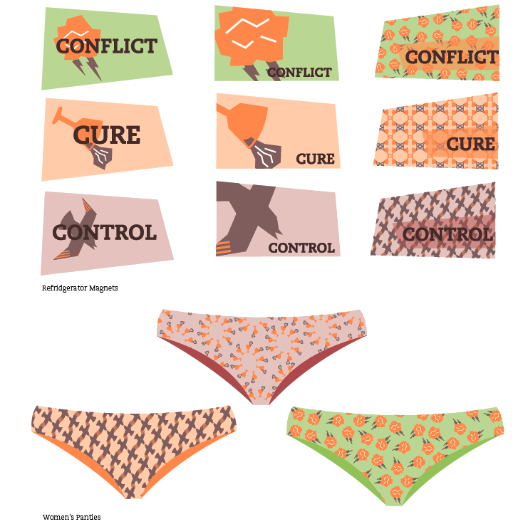
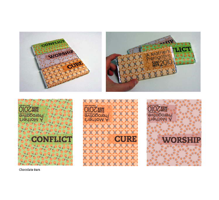
Museum Exhibit- along with my mock ups of the candy bars and post cards. ( to show how I can use some slight contradictions with color and words.)
Info graphics within Magazine spreads
Monogram and book layouts (to show improvement to my magazine layouts)
Change one thing poster (show the process of this, because I thought the evolution of this project was quite a long one for me)
Bus wrap for the weather project (probably not my billboard) (and maybe my animation I did)
Gail Anderson Poster
Seven Deadly sins project/book
6 degress project
and possibly adding in my 'nice to meet you' picture to add some personal flare.
Color theory book (different color fabrics) (to show how I can see and identify color, and be connected to all projects really, due to the way we deal with color now)
Building and initial pen tool exercises (to show where I started with the pen tool and measurements)

I also was interested in adding something I designed in my last semester fiber class.
I thought it'd be nice to show how I'm interested in using fabric and how i could use design outside of class.


The other stuff I wasn't sure about to show or now was:

Patriots and Poppies animation that we did for type 1
hand drawn perfect letter we did type 1

For now, I think having only 5 minutes to showcase my work will be difficult, but I definitely want to touch on my museum exhibit identity, magazine layouts, dot book, six degrees, Gail Anderson, and haiku.

I also think that showing how I transformed my icon set to relay to something else than what they were meant to be would be a good thing to touch on.

Sunday, May 2, 2010

color iterations_gail anderson

So, here are my colors I've been messing with...plus more that I also messed with. But, what I decided on was this:
Also, since the type seems static I integrated the swirls and the type more, like this:

Color, yes, no?