As this project has come to an end, reflecting on the past two and half weeks really went by, fast. I feel that my book is a successful first project to the Graphic Design program. If you have read earlier posts I addressed that my book theme is about different households throughout different families. I finally came to a conclusion with my words.
Coercive
Unhindered
Bourgeois
Nuclear
Incomplete
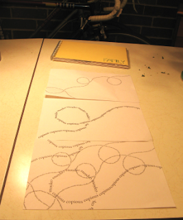
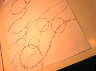
SeveredAnomalousSeveredCopiousDestituteI also narrowed down my compositions to fit my words, so that the viewer can further understand each different household.
This also included imagery. Which for me took quite a bit of time. I wanted to find just the right images, and after several trips to half price books, I feel I was successful in my imagery selection.
To make a book, you obviously want a cohesive piece. In order for me to make my book work well together, I brought in black and white imagery, along with color imagery on each page. Along with some stitching with embroidery thread to give it an extra look and feel.
My background imagery I feel also makes the book work well together as well. I chose a very subtle wallpaper feeling type of paper used for scrap booking.
Here are a few images of my final piece:
 Through out this entire process I learned a lot about how to communicate different ideas successfully, and I have a feeling a lot more will make sense during critique because I'll get different ideas from everyone. But, all in all, I feel that I did improve a lot on how I communicate a composition with a certain type of audience. There are definitely some improvements though, I feel that my imagery was a good, I just wish I could have had more of certain things. Or a different idea of communicating a word through imagery would help on some of my compositions.


