

Friday, April 30, 2010
Type: Gail Anderson

Thursday, April 29, 2010


Wednesday, April 28, 2010
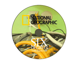
Image: National Geographic
Working through some more ideas and what not and executing our inside, as well as the cd we've come up with some new stuff!!


 I think for the cover of the dvd, which I don't have an image of right now, but it's similar to the poster. We're going to integrate the wrapping of the cords in between the different images to tie the inside and the outside together. Also, working on the stop motion. We're going to look for a more stable place to do it. The frame moves around too much, so a tripod is needed.


Graphic systems: museum advertising round 2


Final direction: Pattern and word
What to work on:
Hierarchy within text
Text legibilty
Type all together
A few different word choices
More integrated items
The purple/pink background should warm up to work better with the peach and light green.
Monday, April 26, 2010
Image: Process
For this project with Image class we are working to develop a new cover for the "6 degrees" National Geographic movie. Working through ideas with my partner Kelsey we discussed what we each would like to show within this concept. Through thumbnailing and talking with Tyler our final direction came to dealing with layers and imagery reflecting cause and effect of what Global warming might be. For the poster and the cover of the dvd book we were going to work with the same format, by spliting imagery up and having each be either a cause and effect. Each image has a certain type of texture so that it can create this mass of different colors and almost the idea of inspection, so that the viewer can be intriqued from far away, and then want to get closer to see what each layer shows.

 Finding new imagery and making it large enough so that it would still apply to the whole national-geographic feel. I don't know...this entire concept to me works, I've been hearing it's boring, and non-interesting and we just need to figure out a way to push it in a new direction or something. The whole fractured feel for each level is so supposed to represent the unstable fact of the world, and the entire idea of global warming, and adding a yellow cast over the image has helped represent the idea of muggy, and dirty. Working though the whole "boring" idea we added some more fractured parts to make it seem like it breaking up more.
Adding more imagery to me seems like it would become a very large cluster of different images that don't seem like they go together due to color, quality and size.


Adding more imagery to me seems like it would become a very large cluster of different images that don't seem like they go together due to color, quality and size.
type: Gail Anderson

Also, instead of working at a 100 percent for this poster like I did, I'm going to work larger so that some fine mistakes with line weight and a not so steady hand will show.
What to push for, more details, and more varying line weight within the swirls.
Friday, April 23, 2010
Graphic Systems: museum advertising
The last project for Graphic Systems for the semester has started. We are developing an identity for a museum exhibit at the Smithsonian. Within this identity we are supposed to use our icons to develop and idea for an exhibit then create materials to advertise the exhibition, and for souvenirs, such as gift bags, coffee mugs, t-shirts (etc.).
For now I have two solid ideas to base my icons story off off. First is the obvious "Problematic Picnic" idea, due to all of my time spent this semester dealing with it. But, also fell across another idea. While doing exercises for the relay and anchorage part I had come across some ideas that relate back to mother hood.
 Working though the ideas and concentrating on what my icons could mean outside of the my initial problematic picnic idea I came across some ideas about feminism with some satirical commentary. I've always enjoyed those silly magnets that have a housewife saying how much they love baking and serving their husbands (it's hard to find well-designed ones too, at least I think so.), so I thought I could make a counter reaction to that idea. Such as:


After critique with Jamie it was said that the Dymo type has too many different connotations within the idea, and I should probably concentrate more on integrating my type more cohesively, and in a different way. I can see why she is saying this, because it is used for a lot of different themes, I just like the idea I think more than how it's working. Who knows, maybe I'll still leave one in somewhere just to keep exploring? Other comments were made to not put the type over the eyes due to the over-done(ness) of it as well. So, I'm working with cliches a little too much here. Which may be because of the idea I'm basing it off of, and I just really need to make it my own.
DIRECTIONS: type and image/ type and pattern
Here are some ideas for my 'Problematic Picnic' series that I'm still considering as well.


 For the most part here comments made were that my images and icon weren't working as well as my pattern and type were working. Also, to integrate more words like "OOPS!" and "AAHH!" So that it is more fun, and also commentary on the issue. It should be fun!
DIRECTIONS: Type and pattern.
For now I have two solid ideas to base my icons story off off. First is the obvious "Problematic Picnic" idea, due to all of my time spent this semester dealing with it. But, also fell across another idea. While doing exercises for the relay and anchorage part I had come across some ideas that relate back to mother hood.


After critique with Jamie it was said that the Dymo type has too many different connotations within the idea, and I should probably concentrate more on integrating my type more cohesively, and in a different way. I can see why she is saying this, because it is used for a lot of different themes, I just like the idea I think more than how it's working. Who knows, maybe I'll still leave one in somewhere just to keep exploring? Other comments were made to not put the type over the eyes due to the over-done(ness) of it as well. So, I'm working with cliches a little too much here. Which may be because of the idea I'm basing it off of, and I just really need to make it my own.
DIRECTIONS: type and image/ type and pattern
Here are some ideas for my 'Problematic Picnic' series that I'm still considering as well.


DIRECTIONS: Type and pattern.
Thursday, April 22, 2010
Gail Anderson Poster Iterations
Working through some poster iterations, and really concentrating on her type style I wanted to play with it. Although, I still feel like I'm not being playful enough. Here are some ideas:


 I feel that all of these are valid, different directions that describe Gail Anderson, just not quite there yet though. It was fun to mess with illustrative type though, its something I've never really presented yet.


Wednesday, April 21, 2010
Museum Exihibit titles
Working through some titles and ideas for my museum exhibit was exciting! It's interesting to see where our icon set can take an audience somewhere else. Or the way we use it can be used in a broader way, so that our initial story can fit into a smaller section of that topic. Here are some ideas (I'm still working on some to make the disaster picnic to a new topic):
One of my ideas was dealing with Moms (from favorite to least favorite):
1. A Mother's Prerogative
2. Mother Knows Best
3. A white picket fence
4. Stepford Wives
5. Mama's Joy
Another idea was dealing with my initial storyline ("):
1. Problematic Picnic
2. "WATCH OUT!"
3. The picnic: A history
4. Accidental Afternoon
5. An outdoor disaster
I definitely need to think about how to make a topic more broad and use the icons over the entire area better. After seeing some examples I think it will take me into a new place and think about things differently.
Monday, April 19, 2010
Liquid 9 Workshop
Friday, some of the students participated in a student work shop with the art director of the Liquid nine, Frankie. Frankie is a recent KCAI graduate (I think it was 2002?) the workshop consisted of thinking about starting up your own buisness, and the steps that would be could to take in case we were interested in doing this once we left school.
For me, I think being part of a small corporation has always been what I'd imagine myself doing, but seeing all of the large businesses that incorporate pattern on cloth are quite large, such as Anthropologie, which I'm still not even sure how the chain works within the designing.
Thinking of this, and also my main interests right now, which would mostly consist of textiles, I thought that I could think about how I could incorporate what I really enjoy within one business.
This made me come to some stopping points though. Getting farther into this program at KCAI I've discovered a lot of other things that I really enjoy besides fibers/textiles. Frankie also asked me an important question. It was a simple question asking what side of the business would I want to take part in, the design side or the production side? I've never really thought of them as being different, due to me still being a student and thought I'd still take care of everything. Although, when looking at the larger picture I'd like to be on the design side of making things (mostly).
Ultimately, what I came up with was some sort of business consisting of fiber, pattern, image, and type. Although, basically all of these components can live by themselves I'd really like to see where I could take this in the future. I pulled images of things that I thought were inspirational and it just got me asking more and more questions, which I will hopefully be getting some answered this summer when I Intern at Porter Teleo.
Here are some inspirational images I had presented to Frankie to sum up me.


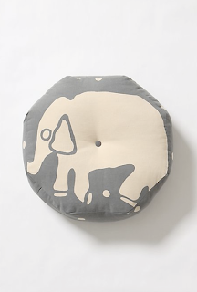

 I'm very MUCH inspired by this designer Rebecca Tegtmeyer and what she is doing with these pillows.
Over all, I'm glad I did the workshop, it definitely started putting my goals in perspective.
For me, I think being part of a small corporation has always been what I'd imagine myself doing, but seeing all of the large businesses that incorporate pattern on cloth are quite large, such as Anthropologie, which I'm still not even sure how the chain works within the designing.
Thinking of this, and also my main interests right now, which would mostly consist of textiles, I thought that I could think about how I could incorporate what I really enjoy within one business.
This made me come to some stopping points though. Getting farther into this program at KCAI I've discovered a lot of other things that I really enjoy besides fibers/textiles. Frankie also asked me an important question. It was a simple question asking what side of the business would I want to take part in, the design side or the production side? I've never really thought of them as being different, due to me still being a student and thought I'd still take care of everything. Although, when looking at the larger picture I'd like to be on the design side of making things (mostly).
Ultimately, what I came up with was some sort of business consisting of fiber, pattern, image, and type. Although, basically all of these components can live by themselves I'd really like to see where I could take this in the future. I pulled images of things that I thought were inspirational and it just got me asking more and more questions, which I will hopefully be getting some answered this summer when I Intern at Porter Teleo.
Here are some inspirational images I had presented to Frankie to sum up me.


Over all, I'm glad I did the workshop, it definitely started putting my goals in perspective.
Subscribe to:
Posts (Atom)