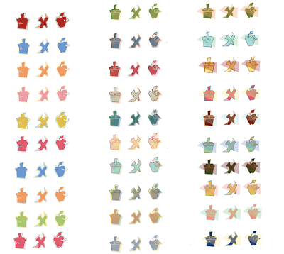
Working through this process it has been interesting to see what types of color combination you can come up with, and if it even gives the right connotations for my basic story line. I'm still refining my icons to what critique had suggested, and little by little I feel that they are getting better. Adding color though in some way I feel changes the look of my icons. It begins to complicate things, and I'm kind of nervous about this. Working with just possibly two colors and making a very simple color choice and icon with no overlay, or background may be my answer. Although, I really enjoy that added element. I'm still working on getting a picnic blanket pattern within each of my icons for the color set. So this way, the farthest right image would have the over lay in the back with a textured pattern, and I feel that this could work, or fail terribly. WORK WORK WORK. Another thing I need to really work on is making my color swatch compositions really work with eachother, making it overall more interesting would be a major plus. Jamie said something to me today that really got me thinking was "make it like a poster"...which totally makes sense, and I should from now on think of it like that rather than just simply placing elements on the page. It's a good opportunity to play with form, and possibly be able to play off of it later.
Also, I'll make a new post about how these color swatches went over, and how I'm going to improve my colors by possibly expanding them to make more of a connection with certain connotations.


No comments:
Post a Comment