Moving forward with this project we now pick one idea for each mode of appeal. My two different packages for ethos and pathos will continue as a series, rather than being two different ideas. Using the same rendering style, and typography will help make this idea come across, and having the boxes be 45 assorted band-aids, and the other being one size will also help showing them on the shelf next to each other better. It was said though, that the color scheme needs to be blue, red, white, and one other color, so I'll be exploring what other color that may be. I need to go back to my roots with color theory, and just base it off of certain color ways.
Final Pathos direction:
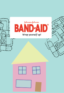
Using the house to show family, and that you should protect your family with say, "bubble wrap" is to say you should use band-aids to protect yourself. I'll be wrapping the package p with bubble wrap, and increasing the size of the type to be able to show through the pattern on the bubble wrap. Also, doing a lot of fun little drawings will be within my process as well. I'm taking out the pattern, because it was just too busy with other illustrations besides the main one.
Final ethos direction:
Adding more detail to this ambulance I think will help a lot. Also, making the band-aids bigger on the back of the ambulance will also show more of the band-aid (which is important). The type on this one is working a lot better than having it smaller, such as in my previous image, because it bold, and big. And on such a tiny package, that's also important to have.
Other Ideas for Pathos:
NOTE: These would all be behind the bubble wrap.
Other directions for Ethos:
My drop shadow skills used to be better....hah
Jamie thought the photographic approach just wasn't working as well as the illustrative approach.


No comments:
Post a Comment