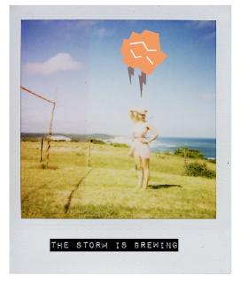
The last project for Graphic Systems for the semester has started. We are developing an identity for a museum exhibit at the Smithsonian. Within this identity we are supposed to use our icons to develop and idea for an exhibit then create materials to advertise the exhibition, and for souvenirs, such as gift bags, coffee mugs, t-shirts (etc.).
For now I have two solid ideas to base my icons story off off. First is the obvious "Problematic Picnic" idea, due to all of my time spent this semester dealing with it. But, also fell across another idea. While doing exercises for the relay and anchorage part I had come across some ideas that relate back to mother hood.
Working though the ideas and concentrating on what my icons could mean outside of the my initial problematic picnic idea I came across some ideas about feminism with some satirical commentary. I've always enjoyed those silly magnets that have a housewife saying how much they love baking and serving their husbands (it's hard to find well-designed ones too, at least I think so.), so I thought I could make a counter reaction to that idea. Such as:
After critique with Jamie it was said that the Dymo type has too many different connotations within the idea, and I should probably concentrate more on integrating my type more cohesively, and in a different way. I can see why she is saying this, because it is used for a lot of different themes, I just like the idea I think more than how it's working. Who knows, maybe I'll still leave one in somewhere just to keep exploring? Other comments were made to not put the type over the eyes due to the over-done(ness) of it as well. So, I'm working with cliches a little too much here. Which may be because of the idea I'm basing it off of, and I just really need to make it my own.
DIRECTIONS: type and image/ type and pattern
Here are some ideas for my 'Problematic Picnic' series that I'm still considering as well.
For the most part here comments made were that my images and icon weren't working as well as my pattern and type were working. Also, to integrate more words like "OOPS!" and "AAHH!" So that it is more fun, and also commentary on the issue. It should be fun!
DIRECTIONS: Type and pattern.


No comments:
Post a Comment