For this first approach I kept a very similar look to google maps and the apple aesthetic. I used a picture for the background to keep it simple and clear the app was about bikes.
Possibly adding more red in could be an option...
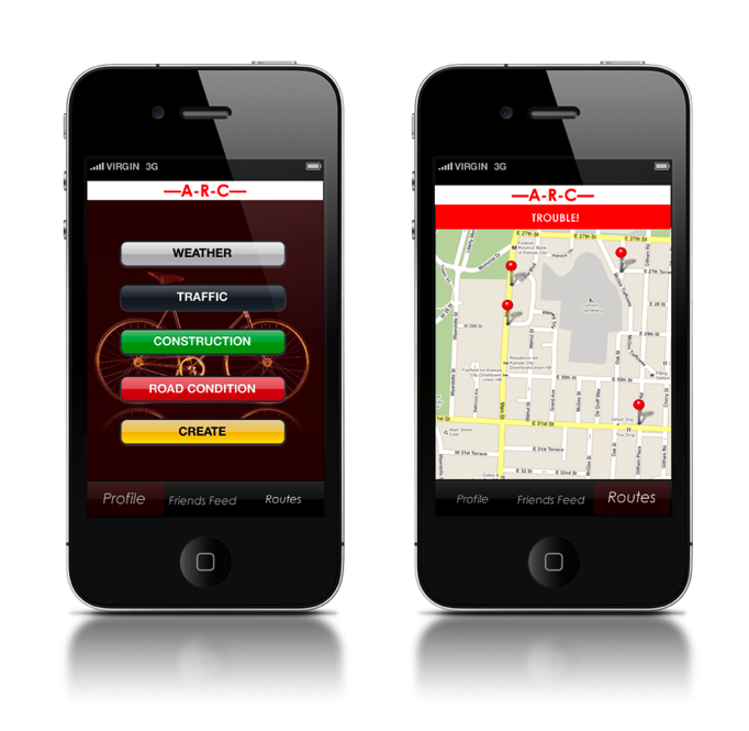
Moving on to the next design approach (while I moved into illustrator), here I wanted to keep the bright colors that they would want to see clearly. Also increasing the size of the buttons I though would be good, incase they were on their bikes multi-tasking.
In the last approach I wanted to simplify the map to it's core. So that if they wanted to push on a certain location, or zoom in on one it'd be clear and easy.
Keeping the colors still bright and fun with a touch of somewhat pattern.
I'm not so sure about the type on the first frame, or if that could even be possible, or legible.
On this one it just has a more simple vector feel compared to the one above which as an image of a wheel with vector shapes on top of it.
I chose the name "ARC" for Alternative route checker. I'm not sold, but I do like the way it looks typographically, as well as it being nice and short.


No comments:
Post a Comment