Monday, November 30, 2009

COLOR BOOK UPDATE


So, hopefully these are close to what each classification represents. Finding every characteristic within fabric/clothing is tough, because there's either not enough, or too much. We'll see how these work. 

Sunday, November 29, 2009

CDF update

SO....due to us not having class this week, I'll give you a low down on how my photos are coming along. I took a lot of photos over the break, I just don't have the actual camera that I took them on. I'm hoping to get them before the book is done for sure. So. I am also working on the grid for the calendar...coming along fine. I've got a pretty basic idea down, but I'm going to expand off of that and make a second one for an idea.

Thursday, November 26, 2009

Progress on animation


Why so scrawny cat? from Taylor Pruitt on Vimeo.


I've tightened some stuff up and did some easing throughout to try and help with the unfinished look. It's hard to judge these things after you've watched it one bajillion times, so I'm still thinking about it.

Tuesday, November 24, 2009

CDF Leaf colors


Picking through color aid, then picking through pan tone, and then finally cmyk was quite the process. Trying to find the right colors to match my leaf, of Course, I'm not exactly sure if this matches exactly, but I feel it's pretty close. It's an interesting process to go through though. Knowing how to print off set is obviously going to happen, and I'm glad I got to know how the printers work.

Sunday, November 22, 2009

Taxonomy update


Some options to decide between. I want to add color to my taxonomy, I just don't know how well it will translate. I'm leaning more towards the black just because it is more readable and it matches the pattern's tone of the black. For now I like the layout I have for the text. I'm still deciding about the table of contents. I'm kind of thinking about having one page with all of my patterns, but of course at a smaller size.


I would also put the images on my tea dyed paper, and then have the text on the vellum. I'm not exactly sure what to include in the table of contents I was thinking just what denotation and connotations were and where my patterns were throughout my book.

For the cover I'll print on butcher paper.

CDF weekly update


Here are some examples of what we were doing in Color class this week. We had to take our 3-D letter form that we assembled and vector it and add PMS (pan tone matching system) color to it. While delineating line, shape, tone, and texture. Messing with the colors was fun, but dealing with texture was not a good experience, I'll probably try and find a more simple texture and hopefully be able to deal with it in a simpler manner.

Wednesday, November 18, 2009

Tweaking web layouts


I have come to find out that it takes a while to get a feel for these things . Intuition is what it is all about, and developing that intuition also takes time. I really want to keep at it though. I think this will definitely be something I try and work on over Winter break. Or at least study them more by looking at a lot of different books and see how each type of layout works, and doesn't work.

For now though, I'm pretty sure I'm decently satisfied with what I've done to them. I've also learned that giving enough space for each part of the layout is crucial; otherwise it is illegible.

There are some tweaks I'd like to throw out there that I'm thinking about though. Which is on the first one, I'm not sure if I want "Fallout" (in the title) to line up with the second paragraph. And in the third one if I should leave in both circle images, or to just have one, or none at all.

Final Storyboard


Finishing up my final storyboard was relieving to get done, basically because it's obviously so much easier to do the animation now. The idea is set, and yes...there can be some tweaking, but hopefully not too much.

Monday, November 16, 2009

Patterns

My final patterns for my taxonomy.

I was wanting to silk screen the marks that I used throughout this pattern, but considering the aesthetic look of the book I felt that the harshness of the marks over the pattern would turn out looking more incomplete rather than just having my patterns and text. So, now I think I'm going to deal with just text on my vellum pages explaining the denotative marks and the connotative marks throughout the patterns. 


Haiku text with image and Storyboards


After working through several iterations with my shapes, I feel that the final static shapes with type work a lot better than what I had in the beginning. The problem I kept coming across was trying to keep the same are of type on each composition, but since my three shapes are so different in shape length and height it was difficult to correspond the text in same area on each frame. Working through it though I found somethings that relate. So I decided to leave my text in the center, but I just move it from the center then to the right then to the left to fit within my object


Working on my final storyboards I decided between two different A to B, B to C, and C to A transitions. In the end though, I feel that what I have is the strongest.

Web layout update


Thursday, November 12, 2009

Progress

Here are some patterns I'm working on for my taxonomy book. Each pattern I'd really like to convey a connotative feeling, which I'm still working on. In the final book i was thinking to have about 5 patterns with at least three different marks within them. 
Connotation: Confusing


Connotation: Acceleration, Rushed, Electric, Quick

Connotation: Determined, Waiting, Patience, Desire
                           

Wednesday, November 11, 2009

CDF week update


For CDF this week we are turning in more photos for our color books. For my theme I decided to go with finding different types of fabric. It came be from clothing, or uncut fabric the store. I like the idea of the up close macro shots on the fabric to get a feel for the color and the pattern involved. The first is a achromatic, which means no color is involved. The one below is probably one o my favorite ones that I've taken so far, but I'm just not sure what to use it for, I'll definitely need some help classifying it.

This last one I was going for vibrating colors. We'll see if it works, I feel that the red and the green/yellow are pretty vibrant up against each other, but the flowers aren't dominant enough, I may need to either retake it, or classify it differently.

NOTES: TIME AND MOTION


Tuesday, November 10, 2009

Reading Response: Vector VS Bitmap

Thinking about the two different ways of showing images is interesting to read about because this reading points out good points about each type of image quality, and points out not so great points about each of these image qualities.

PROS of a bitmap: Better use for Internet, and computer, Able to render color better by mixing different pixels of colors together to make one color on a larger scale, as said in the text: "bitmap images offer just as much freedom as a black canvas."

CONS of a bitmap: There only a certain amount of pixels in an image, no less or more. So, changing the size of an image is more difficult. When it is reduced in size the computer automatically takes away pixels to render the image, but when it is increased in size the computer has to fill up the empty space that wasn't filled in the first place, so it gives it a more block-esque look. A bitmap can never become a vector, unless drawn.


PROS of a vector: When using a vector image the size and color will most always stay the same at different sizes. It can be manipulated without losing coherence.

 CONS of a vector: Vector images can not have the same look as a bitmap. But, a bitmap can look like a vector. So when using vector images it's most likely used for icons, and logos. Vectors also have a harder time at looking hand rendered, rather it has a definite computer aesthetic.


For this project I think I'll stay bitmap. Although, two of my marks and possibly all three could go vector form due to how dark they are. But, In one of my marks they the gradient really helps the feel of the mark. Staying bitmap I think is a good decision though. Going vector I feel holds me down to only one way to show my mark.

Final Haiku shapes


This first set is what I'd like to go with, but it all depends on what others think communicates well and what works best with my poem. The reason I feel that this line works better than the one below is because the object that was used to make the heart shape mark was my cat (from her paw print), which I feel really ties back into my poem really nicely. The first mark is for the line: "Why so scrawny cat?" The middle mark is supposed to represent swimming fish for the line: Starving for fat fish or mice..." Then the last mark is for: "Or backyard love?" I feel that the other shape for "Or backyard love?" works nicely also, it just doesn't give off that heart shape that I absolutely wanted, some think it looks like broccoli.

Monday, November 9, 2009

Ferium: Final Iterations


Here are two of my final iterations. At least I think they're final...Sorry for no outlines.

Friday, November 6, 2009

Taxonomy Proposal

For my taxonomy of marks I'd like to pursue the idea of a pattern book. Within my arrangement of patterns I'll have one translucent page(possibly vellum) with the main mark on it, centered and it being the main focus of the page, and then behind it on the next page, have the marks from that one object formed in a variety of patterns. Throughout the patterns I will have denotative marks with how they are used with pressure, type of medium used, and size. The connotative part will be within the mark itself, due to how abstract my marks are. The reason for the translucent pages is to give the book a foggy look, so that the audience has hint of what they are looking at before they actually do. The paper being used for the pattern pages would be a tea-dyed type of paper to give it a somewhat aged look. For the binding of the book I'd like to make it have a DIY look, so I'm going with a simple book-binding technique found at: http://www.sff.net/people/Brook.West/bind/bindit.html . The thread would be substituted with ribbon, yarn, or embroidery thread. For the cover I'd like it to be black and print my three used marks in my actual haiku on the cover in white to give it a contrast compared to the black marks on the tea-color paper. I would also be interested in screen printing this on the actual cover. Size would be similar to actual book size, close to 5X7. For the "Table of Contents" page I'd like it to have a translucent page as well to introduce the rest of the book. For the Translucent page it would just say: " Table of Contents" and on the actual tea-dyed page would be my Denotative and Connotative words.


Why so scrawny cat?
Starving for fat fish or mice...
Or backyard love?

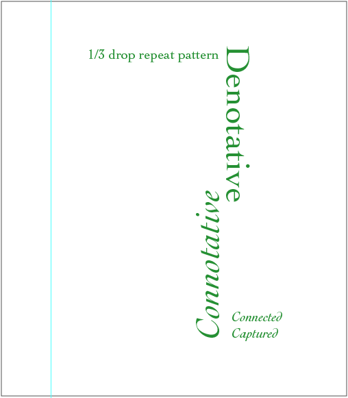
Denotative: Cat, Thin, Whiskers, Fish, Mice, Trees, Bushes, Flowers, Paws, Tail, Fence
Connotative: Sad, Hungry, Willing, Helpless, Desire, Craving, Affection, Companionship, Playful, Somber

Wednesday, November 4, 2009

F+S : Haiku project

I found this poster in my book, "The New Masters of Poster Design", and it's done by Andrew Lewis and is based out of Vancouver Island, Canada. I feel that this poster represents what we're trying to do with our haiku project with making marks. These marks seem to be cohesive as a whole and make an image together, but are very abstract by themselves. It's interesting to see how a lot of screen prints can come off this way because the ink can transfer in different ways each time you make a transfer to the surface you're using, which also brings in how different tools can be used within what you print on. This is similar to our project as well with how many different objects we used to transfer ink to paper.

The Urge to make things

Reflecting over the reading that Leo Lionni wrote was interesting because the way he described how he feels and sees different object when they make a mark. One part that specifically stood out to me was when he said, "Is it possible not to fill the form or the things we make with our feeling and our mind?" I thought of this quote as somewhat confusing, but thinking about it awhile I think the real meaning of this quote is to say that certain object we see should mean different things to everyone. I may see a picture of a kite and think something completely different than everyone else. This being said, this idea really ties into the project we are working on right now. With the whole mark making step and moving on to manipulating those marks to be many different things to all different kinds of people. Within my specific project I have a mark made out of yarn that in some ways makes a fish shape, but to someone else it could be a rain drop. It's interesting what you can associate with a certain object with what type of life you've had in previous years. When Lionni continued this idea he expanded upon the idea how he felt that with people who are object oriented are obviously going to look at the object first and associate what they see with it, he also said that text can be objects within themselves, and he can still associate them feelings and memories. Within this project ultimately this is what I want to go for. When people see an image, I'd like for them to think of themselves in the position, and understand the feeling that is going on within the haiku, from the certain marks that make objects I've made.

Fermium: Layout Iterations

Going into class with my layout iterations the first day was quite a funny day, because it was obvious that I have no experience with page layouts. I have this impulse to make everything filled and full, with lots of information in every area. Which, is probably not the way to go about it. It's all about balance and placement within the page. Working through them I feel I'm heading in a good direction while still having a good time with it. Here are two of my still in progress three final iterations....

Vis Com update: Haiku


After finishing up my 45 iterations of my three different lines to my haiku which I decided to go with:

Why so scrawny cat?
Starving for fat fish or mice....
Or backyard love?

The 45 iterations came from different objects that correlated within my poem. I used:

A small flower
A large flower
Yarn
Bark
My Cat, Callie
A bell from a cat collar
A cat Collar
Cat food
A tree Branch
A walnut from a tree
Leaves

At the top are some of my possible final iterations with my tools trying to follow some of my thumbnails that I have picked. This project has been honestly, quite frustrating. I'm really trying to get through these iterations with successful images within my marks. Studying the black ink on paper is a really intense part because you have to look for something essentially out of blobs and see if you can make a shape that is relevant to your haiku. In the end and once you've made enough marks it's easier to see and have so much more variety of marks. At first I did have thirty pages of marks, and that still wasn't enough and I basically redid the entire marking process. Which, I'm really happy I did. I found some really unique marks that I never thought I would be able to make. Finding mice within bark, who knew?

My words I'm working with:
Cat
Scrawny
Gloomy
Starving
Fat
Fish
Mice
Love
Backyard
Companion