Thursday, February 24, 2011

User Experience: Final KC Bike Commuters


Overall, I'm very happy with the final product. There were a lot of steps to the final product, I can barely remember when we started the initial researching. Working collaboratively on a book was nice because we each saw different ways of doing something, therefore bringing it together made it that much better. Having someone else's eyes on it at all times helps.

Wednesday, February 23, 2011

Info Arch: Final NYT Design

This project as a whole was really eye-opening to me. I've never really designed for the web through and through, and it was a nice and also complicated process. Going through the research phase, then making wire-frames, and then finally approaching the design were all valid, and I am quite happy to know how to go about making a website. Over all the design I went with was a simple, black and white layout depending on image, and type hierarchy. This I felt was a good challenge for me, due to my troubles with type. Overall though, I feel it's a more elegant and polished version than my ones before.

Here is some process from the steps I went through.

WIRE FRAMES:


Site map:

Design process:


(finessing)
and then final:
This overall feelings goes across the rest of the website as well.

Type 4: Process

Here are some images of me playing with simple type and Bethany's images/experiments she did (which were awesome, by the way). I wanted to keep it simple due to her experiments being a nice contrast of complexity.


User Experience: Individual, Health

The most pertinent issues and timely concerns within the individual dealing with health:

Current Issues

-Cancer

-Weight
     -nutrition
     -ingredients
     -chemicals in food 
     -FDA approval
     -diabetes

-Affordable health care


-Sleep and related issues
     -stress
     -insomnia
     -long/bad work hours

-Prescription drugs
     -safety
     -FDA approval
 

Tuesday, February 22, 2011

User Experience: Update

Here are some updated spreads within our book. After choosing a direction we then brought together the design and made everything cohesive. This is a process look, the final is still coming!


Friday, February 11, 2011

 ABOVE: The concept for this design was to play with placement of headers and their background space. By Shifting the placement of the gray space behind images and slightly "off" it could be come a nice aesthetic addition.

 ABOVE: The concept for this was to keep it simple and to concentrate on how the navigation may work. Not using lines will be a challenge, but I'm excited to tackle just using typography as a hierarchy. I have a problem with relying on images too much. (this is the concept I'll be moving forward with.)
ABOVE: This concept was to separate out everything by boxes and to have a over all color tone. Although, I don't think using arbitrary colors is a good idea due to New York Times not even having a true color scheme. Plus, color has too many connotations, no need to misguide anyone by thinking the blue means weather.


PLUS: I really need to add some more basic web stuff, like a search bar....oops.

Notes from Crit:
-Don't use a dot for the navigation, either change the size or the way the type looks.
-Give everything more space. This I can possibly due by making some of the images smaller, and moving everything down.
-Find a different ways to indicate that your in the advertisements.
-Be consistent!
-And give more tracking.

UE: Experiments with Layouts

Organization of book:
 coming

Some test spreads:


These are real loose interations for the layouts, but I just wanted to get a feel for how they looked on the page. The first and second have a different feeling, while the third and fourth have  similar feeling. Due to the amount of imagery we have at our disposal I thought it'd be nice to high light that in our book.

Our format is 7x7. Mainly so we can spread information out more singularly and also due to it's compact size. It's transportable! Which is what our sub-culture is about. The diagrams are no where near where they need to be, so keep that in mind.

Thursday, February 10, 2011

Type 4: C/ID readings

Probably late, but better late than never.

After reading through these readings about each of the identities of the Museums it was interesting to see how we could go about designing for our symposium. Just because the content is not already made does not mean that we can design for it. We make our concept up for the content to fit in. Then it just has to be broad and flexible enough to fit. Or unrelated. Experimentation  is a big part of this project, so probably making that the main focus is a good idea, but we can experiment with a lot of stuff. The Walker Identity was interesting to me because they put so much effort into how the type works in the space and how it can be used. The Museum was the brand, not what was inside the museum. The interaction of the typeface or how ever it was used is also interesting. Not so sure it's user friendly, but it's intriguing. Over all I think this reading helped a lot and cleared up some  connotations about branding. You don't have to include everything inside a space to be part of the branding the specific thing can be the brand (does that make sense?)

a-type-ical: Type 4

Moving on in Type 4 we are getting into the branding part of the symposium. While my journey to my idea may not have been typical (haha) I was thinking a little afar from typography, and thinking more concept base. I know Atypical means being different and irregular. But, I also thought about how blood types are different, some more rare than others, also how all DNA is different, along with fingerprints, and HEY just like typefaces. So playing off this idea, I thought DNA structures, and molecular diagrams were really interesting, especially from a graphic point of view. As well as blood cells and how they look very scientific. So, I gathered imagery for this:

 And then applied some type to images. Nothing special, just to get an idea going.


Moving on I think I will explore this idea some more for Monday, maybe more expressive type. Maybe some analog type...we'll see.

KC Bike Commuters: Presentation images

 Above: Overall view of our presentation wall.
 Above: The Verbal Audit is what I found to be the most difficult. Trying to find sayings and jargon that is said in the bike community is tough, the terminology they use is more about the bike's themselves. So, we thought it be good to point out differences with the vocabulary used from the actual owner of the bike. Each descriptor next to the image is about that bike specifically.
Above: Here is a visual audit of bike in general.
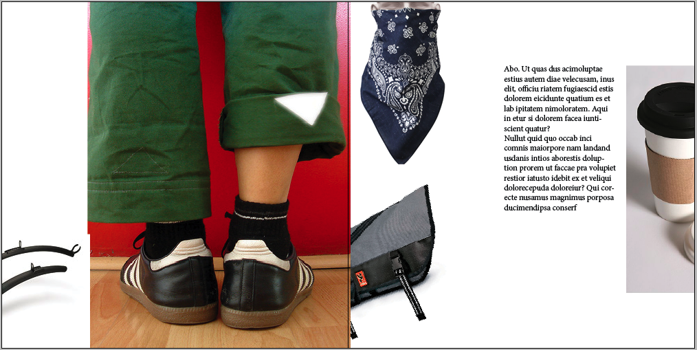
Above: Here is another visual audit of coded references. Ripped pants, and rolled up jeans were big give aways at times.
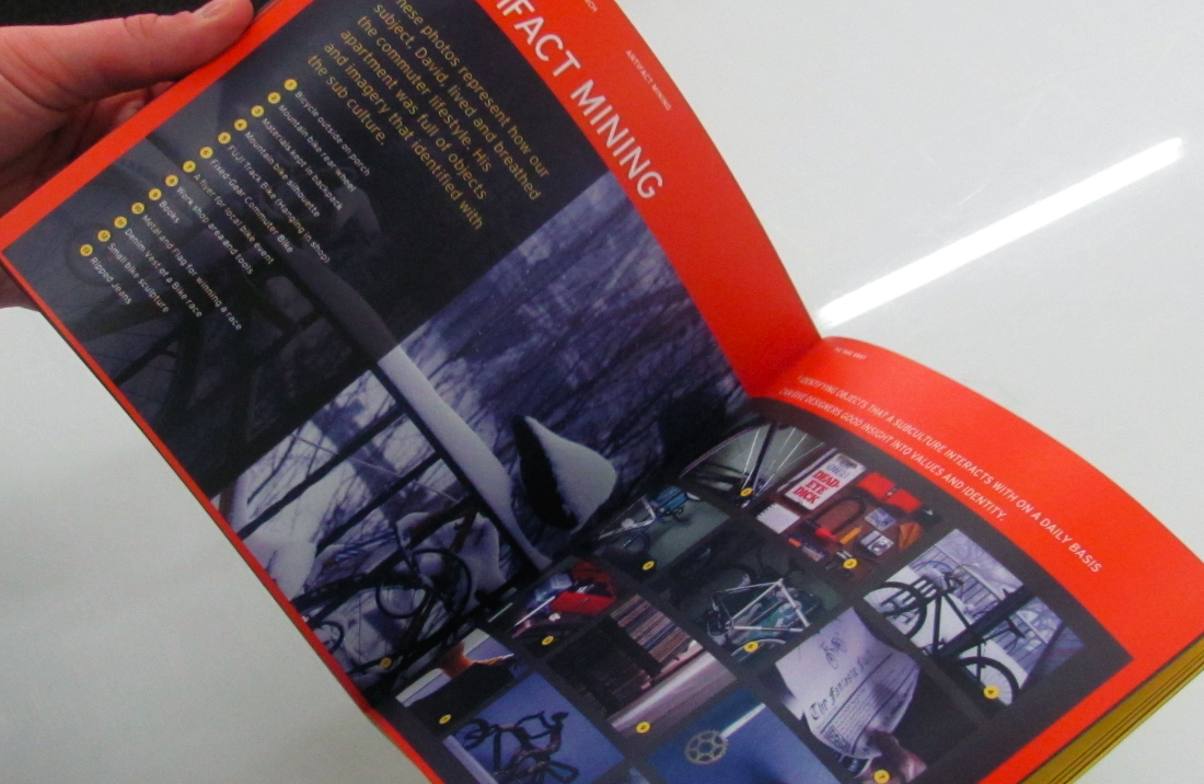
Above: The affinity Visual diagram is about how each thing that cyclist owns has a meaning and each one may fit under a something they value.
 Above: A general affinity diagram talking about their values goals, needs, etc.
 Above: a task analysis of a ride to work in mid town KC.
Above: Finally the Personas we made up based on our research.


Some corrections to make: Label things more, think about how your text relates to the image that is being used (proximity). With the verbal audit use images more to our advantage, show more hierarchy, connect with history, summarize our sub-culture at the beginning of a presentation, maybe add some community things to our visuals, Show our personals a little more throughout the entire piece.


Some things to keep in mind: 

What are 3 defining characteristics that make them part of this sub-culture?
What are common behaviors and rituals that are shared within sub-culture?
What are common stimulation's or motivations for this sub-culture?
What are any overlapping patterns that you find in each interview?
What are dominant social clues or symbols?
What are some verbal codes?
Identify social overlaps with this sub-culture.
What is the S.M.I.T? (Single most important thing)


Tuesday, February 8, 2011

Wire frames and Site map

Scenario One: Primary Navigation tools...Navigating through sections home pages.


Scenario 2: Navigating through text heavy media. Finding an article on a main page then entering it through a brief introduction.


Scenario 3: Navigating through side semi-main article. From the main page to the section.


I did this wrong., so I will be correcting it.