Thursday, April 21, 2011

UX: A Birds Eye View: Ferment; Prototyping with classmates

Moving on with this visual direction I tried to work on the typography, as well as the instruction side of things. Although, Brandon and Karen gave me very good feed back with how I could go about adding in some things to make it better. Such as be more specific with what I give the kids to do with their 'bird eyes' as well as making the bird eyes to be worn around the neck versus holding them. I know I personally need to add more information over all, and be more clear with my directions. As well as work on my typography still. I know that adding icons of the sculpture were wanted a lot. The targets work, but would work better if the icon of the sculpture were there. Also be more detail oriented with the map. Adding texture would probably be a no-no, but adding something special I think is needed for the map. 


^
Inside of the program

The Map on the inside ^

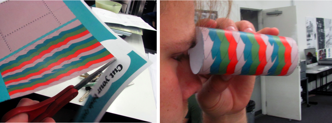
Then below are the bird eyes. I need to figure out a way to make them attach to each other without tape.

UX: A Birds Eye View: Ferment; Visual Directions

 In this visual direction I wanted to show the mixture of the plane and a bird by showing their skin and how they visually could be. Having a fun color palette, as well as having the sky imagery in there shows them being in the sky and having a certain perspective on things.

Some things that were said at crit to work on were to work on the typography, and make the information more organized all together and more simple. Have the places to go on the map and have the instructions for the bird eyes on the inside.


IA: Wire Frame Scenario Choice

After basically combining my three scenarios together, I came out with this!

I'm pretty excited to get started on this project to be honest, designing for something other than a traditional computer screen, and something that everyone could potentially use is interesting to me.

Over all the scenario starts out with a loading/introduction page, then you can either enter in your potential destination, or go to a saved destination to see if there are any problems in those routes.
Next after seeing the warning sign on slide #4 they will click on the problem that is going on and then the map will come up showing all the problems on the map. You can either swipe through, or someone suggested that I connect with google maps and just have all the selections on one screen, then they can zoom in on the problem and see user feedback, with images and comments about the problem area. I would think that each of these users would be rated on their posts, and how realistic they are, while also the area that is being investigated is rated as well, such as if it's a tough area versus something you can probably ride through.

Over all I just want the bike commuter sub culture to have a tool to use to communicate with eachother about problems they come across, as well as connecting to the news and weather stations to see when a good time is to take a bus or completely avoid a car wreck.

Prototype day!

Karen's Critique:


Brandon's Critique:

Barbie Website Live!

The Unknown world of Barbie

Tuesday, April 19, 2011

UX: Three Concepts for Roxie Paine

Working through the ideas I have developed I have three different concepts to move forward with the Roxie Paine: Ferment, day at the Nelson.

Concept one:

A Puzzle of the Nelson Lawn:
Here I wanted to play with the idea of piecing things together just like his sculptures are put together. The child would start the day out with one corner piece and then follow the directions on the back to got to the next station, then when they made it to the station they would get the next puzzle piece, kind of like a scavenger hunt.

Concept two:

The raw day at the nelson:
This concept was more of a treasure hunt where the children would count paces to get the children more involved with counting and get them more excited about making it to the next station.
They would receive a little paper box that folds out with directions and clues to get them to each sculpture.


Concept three:
Through a birds eye view

In this concept, (which is what I'm now producing) The children will come to the nelson and make their own "birds eyes". Very similar to a pair of binoculars they will then be presented with a "guide and map" to find their ways to all five sculptures. I thought it would also be fun to make a pair of bird's wings at a craft site, but I think now it is a little too disconnected with roxie paine.
the reason I chose birds I was thinking about the way that the roxie paine is mechanical and also natural. So Birds and planes seemed to be a good pair.

IA: Final Barbie Website


Finalizing the website I came upon some problems with the coding, but finally got it to work.

Overall the Barbie website was to show how I felt about Barbie, and yes, I probably could have shown that a bit better. I kind of regret not working harder on "The Girl" section to really show my frustrations with the brand and what it stands for. Also, the information graphics I feel were also hurting a bit, I think I was just expecting them to be a bit more developed, or more detailed or something I can't think of.

I'm definitely happy with the over all look of the website though. Changing the colors I think really helped me out with where my point of view stands. Also the barcode shows the idea of consumerism and barbie play together.

IA: Icons and Gestures

The readings were enlightening, and it was nice to see the basic break down of the two elements that the iphone/touch entail.

five points from the readings

*Keep the gestures simple.
*Provide good feedback to users their gestures are being recognized.
*Make sure all icons are standard so nothing looks too out of place.
*You can have multiple icons for one action.
*Make sure to have enough space to function properly.

Monday, April 18, 2011

IA: Project 3 Brief: KC Bike Commuter's Tailored iphone app

Picking out an iphone app to design I went with the one that addresses the problem of bad traffic, and weather concerns. While including a sense of community, I'll be bringing in the feature of friend alerting one another of things on the road to look out for.


AUDIENCE: Kansas City Bike commuters
PROBLEM and SOLUTION: Finding the right route is difficult, especially if there are problems on your main one, so my app will show bike commuters different ways they can go around those problem areas such as: weather, traffic, construction, or road problems like a pot hole or gravel roads. 

Tuesday, April 12, 2011

type4:Some thoughts


Using tool for a material came pretty spontaneously. While being at the craft store picking some materials that I personally thought would be fun, and some what experimental I found that tool was super cheap, and they had some great colors to choose from. So I picked four different colors out, that I thought would layer nicely on top of one another. Due to that being my first instinct to play with. So, when taking photos of this experiement I was surprised by what I saw in camera. The idea of movement it has, while being still is really interesting. I've shown it to a few people, and they always think I had moved the material to get that effect. Although this process while being static and looking like it's moving is interesting, it's also a good question to ask how far I can take legibility with this. Can I spell a word by single letters being layered upon one another? Does the consistency of the tool matter? Like, would a larger weave have the same effect?


Take was an experiment by thinking about how small I could possibly get with some felted type, while still being somewhat legible. the crowdedness of the letterforms were actually kind of hard to make, because keeping that small of wool together and still being able to read was difficult in its own. Leaving it over night for the cats to pay with wasn't helping either, but once I arrived at school it was even more illegible, but still people could read it. With this type of material, I know I think it'd be interesting to see a large amount of text all next each other. Somewhat webbed together. Comparing this to the letter forms I made to be handled with less care, I can definitely see a difference in delicacy. When looking at this word, and then one of my needle felted A's I made the attitude towards it becomes more tightened, and concerned with how it's going to be handled. Such as, when I hand this off to a friend, they are much more aware of how they touch it, versus my knitted A. 


The F Study was the start of using profanity in what I was making. I wanted to see the relationship between form and content. Although, this isn't an "A" I can see how this material can manipulate it's meaning by the look and feel of the object. The characteristic feeling this f has is fun and playful, almost dinosaur like.


Playing around with needle felting some more and seeing the relationships between having a counter in the A and not. Also playing with the back and front side of the object. Seeing the relationship in form between the back and front is interesting, because of the process of needle felting it started showing through on each side, so then it interrupted each form.


This was more to see how transparency and filling the letter completely would look. Due to the tool being more sturdy and more net like I felt it lended itself to a more case like feel.

The knitted A was fun to do to because I got to make my own grid for how the A would look. The process took me  A WHILE to finally get it right, and just for credit, this was my first letterform knitted...not sure what the correct term is for that though. The serif A is not exactly lending itself to looking like a serif, but the idea is there. Formally compared to the rest of my A's it's definitely seen that it more organized and definitely based off of a grid, so less free flowing, and more tight.


My tiny fleece A was to see the relationship between the felted F and this, by size and stitching method.


 ^^^^^^^^ EDITED ABOVE ^^^^^^^^

Here are some studies I've been doing in type four class. Looking at the formal relationships and studying the difference in material and how each were made, it is interesting to see the difference in what the letters are expressing. 

When I started experimenting the idea of a control group was vacant in my mind, so I was thinking I would just go and make a ton of different things....then I was brought down to earth. (not saying anything bad about this idea though). I needed something to study, versus just studying the materials I use. So, I then explored the idea of using profanity as my control group. Due to my formal decisions I thought would be silly/interesting to see the juxtaposition of something cute/soft paired with a profane word.

After show and tell on Monday, I realized that some processes/materials were more liked than others, and definitely the tool A was more favored among the bunch. Moving on with this though, I want to explore words within this. Now that I've looked at difference materials, and how they act and compare to others I'd like to bring in content. Now, just what is that content.

Thursday, April 7, 2011

User Experience: Final Traceables Design

From crit on Friday I was told to soften the look and feel of the community website, also to make it little more earthy. I hope that I did a decent job of that.
TRACEABLES

Monday, April 4, 2011

ia: explorations


Some visual explorations of the barbie home website.

IA: updated barbie aesthetic

Still getting the header part down. Incorporated the barcode in other areas may be the answer. Definitely a more dark, gothic look at barbie.

Sunday, April 3, 2011

type4: Questions

Well, I definitely think my first question that I need to think about is if: I want to stay within one type of material. The word "fiber" can go a long way, so I may just consider using that as my material. SO

QUESTIONS:
1.) How can I mix materials with each other, by making good and bad visual relationships.
2.) How will those relationships be successful?
3.) How far can manipulations to letter forms in a physical space go, and still be legible?
4.) How far back in the process of materials can the type of manipulation make on the letterforms? (such as what type of yarn I use, or where the wool came from.)
5.) What other types of materials can I incorporate that are not fiber related, such as glue, matte medium?
6.) How dangerous can the materials I use get? (such as insulation fiber glass)
7.) Where will my experiments live?
8.) How can the environments they are either made in, or get presented in connect with the content provided.
9.) How can the process of making each letterform inform the content, by either time that it take to make, or materials used.
10.) How can scale be incorporated within the process and final presentation?


How can different materials manipulate one letterform. Such as an A or an F? 

user experience: traceables process


^^^ First Round ^^^^


^^^ Second Round^^^

Some iterations of the header:


After the second round interation, making a an actual blogger, or wordpress site, so after that class critique I got started on html and modifying a blogger site. It developed into something I was impressed with, because I have never touched code, and nor did I ever think that the possibilities were there. I was really thankful to Ian for helping me a ton.

Here is the final blogger page: TRACEABLES


but also the other components: