Showing posts with label image. Show all posts

Thursday, May 6, 2010

Image: Six degress final

Coming to the end of the last project in image class which was the six degrees project. It was fun, and interesting to have an issue brought to you, that you then had to solve with a partner. Which was the first time we all had to deal with having partners in the design department all the way through a project. It was nice not having the entire ordeal on your shoulders but we definitely had to deal with how each partner worked, and seeing how we could bring both of our aesthetics to the idea. Over all I liked working with Kelsey a lot, we have different views on the issue, but with putting it aside and concentrating on the project was number one.

Working through our idea and trying to make it not so boring, and bringing all the elements we wanted to show with the project together really came together the last week or so by adding the elements that we had in the inside of our dvd cover to the outside, and while adding the outside to the inside.

And the final poster.

Final Review Proposal

Looking back through all of the projects I have done these past two semesters I've seen it's definitely been a trip. A trip of improvement, a trip of brain farts, and a trip of mistakes. For my final review I've listed things down for the past couple weeks thinking about what I'd like to show and to show how they connect together.
My list of pieces to showcase:

Dot book (to show how I can deal with type and image together)
Line book (juxtaposing, showing process!)
Haiku animation and taxonomy
Icon set (showing all steps to coming to the final color icons)
Museum Exhibit- along with my mock ups of the candy bars and post cards. ( to show how I can use some slight contradictions with color and words.)
Info graphics within Magazine spreads
Monogram and book layouts (to show improvement to my magazine layouts)
Change one thing poster (show the process of this, because I thought the evolution of this project was quite a long one for me)
Bus wrap for the weather project (probably not my billboard) (and maybe my animation I did)
Gail Anderson Poster
Seven Deadly sins project/book
6 degress project
and possibly adding in my 'nice to meet you' picture to add some personal flare.
Color theory book (different color fabrics) (to show how I can see and identify color, and be connected to all projects really, due to the way we deal with color now)
Building and initial pen tool exercises (to show where I started with the pen tool and measurements)

I also was interested in adding something I designed in my last semester fiber class.
I thought it'd be nice to show how I'm interested in using fabric and how i could use design outside of class.


The other stuff I wasn't sure about to show or now was:

Patriots and Poppies animation that we did for type 1
hand drawn perfect letter we did type 1

For now, I think having only 5 minutes to showcase my work will be difficult, but I definitely want to touch on my museum exhibit identity, magazine layouts, dot book, six degrees, Gail Anderson, and haiku.

I also think that showing how I transformed my icon set to relay to something else than what they were meant to be would be a good thing to touch on.

Friday, April 30, 2010

Plaid shirts

What a coincedence!

Wednesday, April 28, 2010

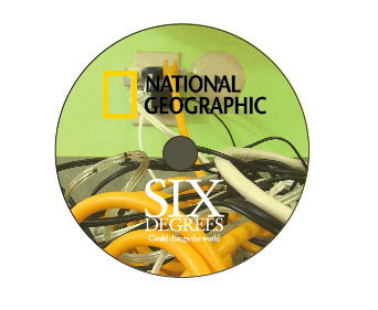
Image: National Geographic

Working through some more ideas and what not and executing our inside, as well as the cd we've come up with some new stuff!!

I think for the cover of the dvd, which I don't have an image of right now, but it's similar to the poster. We're going to integrate the wrapping of the cords in between the different images to tie the inside and the outside together. Also, working on the stop motion. We're going to look for a more stable place to do it. The frame moves around too much, so a tripod is needed.

Monday, April 26, 2010

Image: Process

For this project with Image class we are working to develop a new cover for the "6 degrees" National Geographic movie. Working through ideas with my partner Kelsey we discussed what we each would like to show within this concept. Through thumbnailing and talking with Tyler our final direction came to dealing with layers and imagery reflecting cause and effect of what Global warming might be. For the poster and the cover of the dvd book we were going to work with the same format, by spliting imagery up and having each be either a cause and effect. Each image has a certain type of texture so that it can create this mass of different colors and almost the idea of inspection, so that the viewer can be intriqued from far away, and then want to get closer to see what each layer shows.

Finding new imagery and making it large enough so that it would still apply to the whole national-geographic feel. I don't know...this entire concept to me works, I've been hearing it's boring, and non-interesting and we just need to figure out a way to push it in a new direction or something. The whole fractured feel for each level is so supposed to represent the unstable fact of the world, and the entire idea of global warming, and adding a yellow cast over the image has helped represent the idea of muggy, and dirty. Working though the whole "boring" idea we added some more fractured parts to make it seem like it breaking up more.

Adding more imagery to me seems like it would become a very large cluster of different images that don't seem like they go together due to color, quality and size.

Monday, April 12, 2010

Image: Final Book Cover

Finishing up the book covers for image has been a process, and I wish I had more time on them to be honest. It took me a while to get my concept, and I want to expand more on what my final theme is. I started out with just having one image on a background, and adding a filter to them to make it look different. Although, it matched the content, it was quite generic, and I needed some time to find more interesting images, and maybe deciding a metaphorical sense. In the end I went with a collage idea, and had fun with it. Although, with me being behind in my decision making, I feel it may have hindered my final product, but over all I'm pretty proud of the. Here are some of my documentation photos I took.


Here are some initial sketches I started from..

Wednesday, April 7, 2010

Book Covers

I have no idea why this project is making me have so many mental blocks. I keep pushing myself in the wrong direction all the time. Maybe it's because of the magazine layouts and information graphics we're doing at this time as well, in which we have to be more representational. With these book covers to make it look more interesting I feel that there has to be more to it than that. Some sort of metaphorical sense, and or some sort of opposite meaning of the book title. For now, I'm developing more of a collage look rather than just image on pattern. I think I'll still be integrating my pattern within the book cover, just questioning how much, or even which one. For now, I really like what this girl does. I'll definitely look to her for inspiration. For now, I know I have to get to work to get the final idea done for Monday. YIKES!

Here's some progress for where I'm at right now, I plan on using these images still, just in a different way.


...still questioning the green aspect.

Monday, April 5, 2010

Image: Book Cover Iteration

Working though my ideas I had for this project it was kind of tough envisioning something I wanted to produce. I knew of an idea I'd be going for, but I just wasn't sure of how to execute it. I wanted to incorporate embroidery within the text. and also, a fabric background. So, after looking at everyone else's on last Wednesday, I was even more confused. I was stuck with how far to go with the collage feel and how to not make it look like crap. So, I played with photo shop a bit, and I'm not saying I figured it out by any means, but I definitely took a step in the direction I've been wanting.


 The Outrageous book of games and how to prevent food poisoning is still pretty rough. I'm stuck with the typography, and total composition I think. The type I'm confused because I don't' want to write the entire title in cursive embroidery, I feel it would be too much and no one would be able to read it. So, the color of the text is where I'm stuck. Should it be the same as the tread? Or the background, or the object in the image? I can only use three colors, and I think black and white don't count for my color usage, but you can only go so far with that.
Also, the filter I used I think helped too. I'm haven't been a big fan in it, but I found that i can work with certain things, especially if you aren't good at cutting items out of photos in photoshop, like me.

Wednesday, March 24, 2010


Here are some book covers that I've found on the book cover archive. I really enjoy these. Especially the Nabokov books. They used a box which I thought was interesting. Working through ideas about my book covers I have been really questioning my initial approach. I would definitely like the classic eclectic feel to be part of my series for my picnic books. Although, incorporating vectored icons into the mix may contradict that. At least executing it successfully would be difficult.


Here's a cute picnic book cover....

Monday, March 22, 2010

Book Covers


These can all be found on Amazon.com

Tuesday, March 9, 2010

Seven Deadly sins wrap up.


Here is the final book, start to finish.


FIN!

I really enjoyed this project. It was a lot of fun taking photos of my roommates and going a little extreme with some of them (wrath). It was also really refreshing to do something different; something not so graphic, at least that's the way I think of it. I also learned a bunch from doing this project. Such as, it's a good idea to just mess around with some compositions and ideas even if you're main idea isn't ready to do, and perfectly in tune. Also, using people isn't the easiest thing in the world, especially at art school. Everyone has their own deadlines and things to do. So, I really appreciate how cooperative my friends were with me. I probably set up and shot the whole thing 3 times, and then reshot one scene to get it working better.

Another thing I learned was don't wait to upload photos, especially if you're borrowing a camera. Get them on your hard drive before they disappear to 'delete' land.