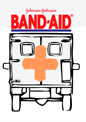
Moving forward with this project we now pick one idea for each mode of appeal. My two different packages for ethos and pathos will continue as a series, rather than being two different ideas. Using the same rendering style, and typography will help make this idea come across, and having the boxes be 45 assorted band-aids, and the other being one size will also help showing them on the shelf next to each other better. It was said though, that the color scheme needs to be blue, red, white, and one other color, so I'll be exploring what other color that may be. I need to go back to my roots with color theory, and just base it off of certain color ways.
Final Pathos direction:
Using the house to show family, and that you should protect your family with say, "bubble wrap" is to say you should use band-aids to protect yourself. I'll be wrapping the package p with bubble wrap, and increasing the size of the type to be able to show through the pattern on the bubble wrap. Also, doing a lot of fun little drawings will be within my process as well. I'm taking out the pattern, because it was just too busy with other illustrations besides the main one.
Final ethos direction:
Adding more detail to this ambulance I think will help a lot. Also, making the band-aids bigger on the back of the ambulance will also show more of the band-aid (which is important). The type on this one is working a lot better than having it smaller, such as in my previous image, because it bold, and big. And on such a tiny package, that's also important to have.
Other Ideas for Pathos:
NOTE: These would all be behind the bubble wrap.
Other directions for Ethos:
My drop shadow skills used to be better....hah
Jamie thought the photographic approach just wasn't working as well as the illustrative approach.
Friday, October 22, 2010
Thursday, October 21, 2010
Wednesday, October 20, 2010
Type 3: Koenig Layouts
These three images are of the layouts that were a good direction to head in last week, working with my 5 column, 4 row grid will be fun, and also nice to have some flexibility to it.
The type faces I'm working with are Caecilia, and Franklin Gothic.
I'm also wanting to add some graphic elements through the entire layouts.
Now for this week!
Notes from crit:
-Make the graphic boxes mean something, and not make them default device.
-Work with less change in column width. Try and stay within an idea, and tweak it nicely, and slightly. -Not a huge jump.
-Stay consistent!
-Overlaying text is a good idea, make legible.
-Mimic the way I use the images within my text
Due to amount of content I plan on rearranging my book to have sections of different dates, so it will have an opening page to each section of dates, then have the houses, or buildings within that section. It was nice to see and hear the lecture today, because it made me thinking about all the other things I can add to my layouts, such as graphic elements, and the idea of working with a grid not on a grid.
Tuesday, October 19, 2010
PATTERNS!
Just working on finishing up my first series of patterns for my Direct Study, I'm doing in Fiber. I'm doing a series dealing with wood type. Three will be hand printed, while the others will be digitally printed.
Still not sure on what my color pallet will be, but it's a gettin' there.
Monday, October 18, 2010
Ethos: Band-aid First mock ups
Here I would have the doors to the ambulance actually open to get the band-aids out of the package.
NOTES from group crit:
-Be careful of the logo and the image, give more space for them to breathe.
-Type set the "#1" instead of the hand render.
-Integrate the number one better as well. (drop shadow?)
-Simplify drawing
-Use drawing instead of image
-Play with background colors.
-Still use red and blue (good color combo)
Friday, October 15, 2010
Progress: Pathos First Mock Ups
Moving forward deciding which direction and what to mock up. I tried different variations with type, and rendering methods.
For this idea I illustrated a pattern of band-aids on the actual package, while wrapping it with bubble wrap to get at the idea of protection. This will be the directions that I'm moving forward with Pathos, but I need to bring some new elements to it. I need to have a different idea of what the bubble wrap is protecting, so maybe bringing in some old ideas about what band-aids could protect. So i'll be writing a list of things that need protection, or that could get protected by bubble wrap?
Here are some different ideas and color schemes for the idea of fixing things that kid would fix with a band-aid. The pattern in the background is supposed to show that there are assorted sizes within the package, and the shapes of what may be found in that specific box. For the teddy bear, I may bring into the idea of having bubble wrap around it.
For my last idea, Band-aids being the protector, such as a fence can protect a lot of things from getting inside that area. I like the last one best out of these because it's simple, but the band-aids aren't as detail as I'd like them to be. I felt the red was appropriate because of the idea of band-aids covering up scrapes where blood is involved.
For this idea I illustrated a pattern of band-aids on the actual package, while wrapping it with bubble wrap to get at the idea of protection. This will be the directions that I'm moving forward with Pathos, but I need to bring some new elements to it. I need to have a different idea of what the bubble wrap is protecting, so maybe bringing in some old ideas about what band-aids could protect. So i'll be writing a list of things that need protection, or that could get protected by bubble wrap?
Here are some different ideas and color schemes for the idea of fixing things that kid would fix with a band-aid. The pattern in the background is supposed to show that there are assorted sizes within the package, and the shapes of what may be found in that specific box. For the teddy bear, I may bring into the idea of having bubble wrap around it.
For my last idea, Band-aids being the protector, such as a fence can protect a lot of things from getting inside that area. I like the last one best out of these because it's simple, but the band-aids aren't as detail as I'd like them to be. I felt the red was appropriate because of the idea of band-aids covering up scrapes where blood is involved.
Progress: more thumbnails
From this idea, I am going to explore Pathos for this week, and my three directions are with bubble wrap, the series with fixing things (i.e. a teddy bear, or bike tire) and the series with protecting things (i.e. a house, a fence, and a tank).
Tuesday, October 12, 2010
NA: Logo storyboard
Color and none color. I decided to go with the white background for it to be more versatile for color and different textures in the ditto part. Also, I'm not sure if this five frame storyboard is hard to tell, because I feel there are so many other steps in between, but maybe that was so it could be more simple as a whole.
NA: Logo Animation
Here are some ideas for my logo build, Ditto. Talking to some classmates about them, they thought it would be a good idea to maybe include more than one idea into two...because a lot of my ideas were quite simple.
For the one I am planning on working further on I'm intertwining the idea of the of the stitching into the final logo, but also making it very up close and abstract by it following the line throughout the handwritten text. We'll see how it goes.
Ditto: Logo
Here is some logo process. I turned in a logo earlier into Tyler, and it had a rough texture on it, because I wanted to maybe elude to the idea of it being handmade, but I further explored it being a vector piece because it could be a cute, clean cut and uneven look.
BEFORE:
NOW:
I'm definitely favoring the second one because of the clean cut line, but it still looking hand written becuase of the uneven t's and different line strokes.
Here is also a version with a texture/color inside.
BEFORE:
NOW:
I'm definitely favoring the second one because of the clean cut line, but it still looking hand written becuase of the uneven t's and different line strokes.
Here is also a version with a texture/color inside.
Subscribe to:
Posts (Atom)