For my first find, I found this Andrew Bird poster by: Paper Music, found on Poster Cabaret.
Personification is used by having the heard in the United States, and therefore it's adding a human quality to an "inanimate" object. ( I was kind of confused to reference the United States as an inanimate object, but for this I felt it was appropriate).
for the next one: An art print by Invisible Creature.
I thought of this one as being hyperbole, because after reading all sorts of different definitions given, I read that finally it was an exaggeration. So there for in this print the bike is being splattered all over, saying that it's been ridden A LOT. Enough for it to fall apart, so an exaggeration.
Here is my and Ray's mood board made for Joe Lovano, "us five". It was pretty fun making the mood board with someone else, because we each got to put our efforts in. Ray brought something to the table that I wouldn't have thought about, and I did the same for him.
We wanted to really concentrate on the color, due the music being colorful. all the random imagery had a lot of rhetoric attached.
After finishing both readings that were assigned it was interesting to see how differently they were written. One was quite straight forward in it's words and how it rhetoric was described, and one was questioning things more, really tearing rhetoric apart, and trying to figure things out.
In Meggs article there was a quote that was said by Hanno Ehses, "Broadly defined, rhetoric is the art that deals with the use of spoken or written discourse. Its object is eloquence, which is defined as effective speech. According to Aristotle, its concern is with 'discovering all the available means of persuasion in any given situation' either to inform (rational appeal), to delight and win over (ethical appeal) or to move (emotional appeal) an audience." I found this quote interesting because sometimes not all graphic design, or advertisements are any of those means of persuasion. Some are down right wrong, and send messages that the public could do with out. Such as, the typical fast food advertising. I can't see fast food advertisements being rational, ethical, or emotional. Maybe I'm thinking of it in the wrong way though. I'm thinking of this as more of the position of the graphic designer. So, making advertisements for McDonald's doesn't seem like a very ethical thing, because everyone knows that a McDonald's double cheeseburger and large fries can't be good for your insides. I could also be bitter, because I support those advertisements by visiting McDonald's every so often. It was also nice to have all the definitions right in front of me about all the different types of rhetoric there are.
Moving on to the Bonsiepe reading...
Within this article I found some of the points made were a bit of my head, and I had to read them a few times to really "get it". I really enjoyed how Bonsiepe brought some familiar definitions about semantics. It was nice to see the bridge being made between the two things we've learned. Rhetoric is semantics for the most part. All of the things involved are either indexes, symbols, or icons. Thinking of rhetoric in this way makes me really want to revisit all the things we did last spring semester, and figure out how I even thought about signs. One part did really get me going, "huh?" which was When Bonsiepe starts talking about how certain designers are "blinded by their effort to impart objective information. They cannot reconcile themselves to the idea that advertising is addressed information, and that its information content is often secondary if it plays any role at all." I can read what it's saying, but I can't really digest it.
Origin: Born in Cleveland, Ohio on December 29th, 1952
- Very musical household, almost everyone was involved with music one way or the other.
- Started playing alto sax at the age of 5 while a couple years later moving into a tenor sax.
- Attended Berklee College of Music in Boston and shortly after graduation made his recording debut with organ master Lonnie Smith and worked with Jack McDuff.
- Joined Woody Herman’s band shortly after.
-
-Woodrow Charles Herman (May 16, 1913 – October 29, 1987), known as Woody Herman, was an American jazz clarinetist, alto and soprano saxophonist, singer, and big band leader. Leading various groups called "The Herd," Herman was one of the most popular of the 1930s and '40s bandleaders. His bands basically played jazz and blues, often including rather experimental material for their time.
- "Brother" Jack McDuff (September 17, 1926-January 23, 2001) Born Eugene McDuffy in Champaign, Illinois, McDuff began playing bass, appearing in Joe Farrell's group. Encouraged by Willis Jackson in whose band he also played bass in the late 50s, McDuff moved to the organ and began to attract the attention of Prestige Records while still with Jackson's group. McDuff soon became a bandleader, leading groups featuring a young George Benson, Red Holloway on saxophone and Joe Dukes on drums, often performing with an organ trio.
- Dr. Lonnie Smith was born in Lackawanna, New York, (just outside of Buffalo), into a family with a vocal group and radio program. Smith says that his mother was a major influence on him musically, as she introduced him to gospel, classical, and jazz music. He was part of several vocal ensembles in the 1950s, including the Teen Kings. Art Kubera, the owner of a local music store, gave Smith his first organ, a Hammond B3.
-Folk Art is his 22nd album with his record label Blue Note.
- Jazz Times named Folk Art, “Album of the year.”
-Lovano broke both arms in two different accidents at the end of the year in 2009 that costed their tour to be post poned.
Band Members:
- Pianist is James Weidman which is know to be a veratan and has worked with Lovano before.
- Bassist is Ezperanza Spalding who is a rising star in the world of jazz. She is 25, and also teaches at Berklee.
- Drummer: Otis Brown is a new comer in the scene
- 2nd Drummer: Francisco Mela.
- The reason for two drummers is because it makes things more dynamic, and more interesting.
-“Open-ended approach and expansive freedom, Spalding, Brown and Mela are unafraid to venture into unfamiliar territory, forcing Weidman and Lovano to challenge their own concepts of expression.”
- After reading about Joe Lovano, Us Five I have realized that they are quickly rising group within the Jazz community, world wide. I have yet to read a bad review. And it’s really interesting how each place describes them positively in different ways.
- They are adventurous, influential, appealing, fearless, youthful, eclectic, full of character, fun and spontaneous.
Random Facts:
- Joe Lovano has a nickname of Cat in the Hat
- He has taught and has been a guest at many different colleges: William Patterson college, NYU, New school of jazz program, Guest clinician at Julliard, Manhatten school of music, and the new England conservatory of music, east man school of music, and university of Miami. Also has visited Belgian, France and Tokyo universities.
- Has named a few songs after influential people on Folk Art.
- Grammy Winner, nominated twice, won once.
- Want people to think Jazz in the folk art of America.
Through out brainstorming and thinking about what I'd like to concentrate for the semeseter in N.A. I was wanting to go two different ways. Either an informational way of seeing how women in the Middle East are decorating their own burkas, and how some younger women are completely designing their own with custom colors and different patterns. Another way is to build on the workshop that I did earlier this year in the Spring semester Frankie, from Liquid 9. I decided to make up my own company that made textiles. Due to additional information, I feel that the textile company would be a more accessible idea, rather than over stepping my boundaries with dealing with the way women dress in the middle east, even though it is a very interesting topic to me.
So, moving on to my brand-based narrative.
I will be making up my own design firm/company that either has their own textiles, or that makes items out of their textile line.
I'm really in love with this company: Bokja Design
They are obviously a fun high end type of company, and I am really attracted to something like that. Although, I thought it'd be nice to have something that the average person could enjoy, due to me being that average person but still looking high end. So essentially, I have to ask myself what type of audience do I want to attract? Who am I competing with? What is my story? And, what exactly do we make?
After interning at Porter teleo this summer, and then also continuing my internship with them, I think will help me a lot in how I can see how an actual high end company is ran, and what sort of image they are portraying to their audience. I need to find something different about what I'm going to do, and make it special.
Coming to an end within the second semester at the KCAI graphic design department it has definitely been a trip (like I said earlier). I know coming into this department I was warned of the workload, and the intense scheduling. And the warnings were valid, I especially know this coming to an end of this year. I felt that this year I have grown as a designer in a way I never thought I would before. I never thought to myself when I was in high school, "oh, I want to do design". NEVER did that come up. I don't even really know how I came upon the idea of wanting to be apart of this world. I was always so wrapped up within black and white film photography. (I'm getting off base, sorry) BUT, what I was getting at was the idea of how far I have come as a person within the department. I've been tested in many ways. Especially questioning myself for why I'm doing what I'm doing, and what I'm putting myself through. All the loss sleep and slight anxiety attacks the night before a critique I sometimes question if this is worth what I'm going to end up doing with my life.
Anyways, for the most part I have discovered a lot of new things that I think have always interested me, just never knew what they were really. Such as the idea of having a narrative within my work, I think looking back at all the work I've done throughout my life it has always involved a narrative. It's always been something I've been interested in, just never had a word for it, or that connection. Another thing I've noticed that I do is comment slightly on social issues within the narrative I've played with. Especially in my museum exhibit, and dot book that I did at the beginning of the year. It's becoming this idea of feminism that I've never really FULLY explored. And I really enjoy the idea of moving deeper within a subject and finding a conceptual way to ironically tie two different elements together.
I'm not sure if this is the idea of "semester reflection" that we were supposed to do, but I feel that when I do think about my semester and year as a full I've learned, and discovered new ideas, and new theories to base my design off of now. To take it to the next level, because I'd like to take it to the next level, but also keep myself within the next level.
Starting out with making patterns with our icons, trying to comment on how they would work with a narrative background. More of a conceptual view. Such as my birds circling the ants.
With this step we explored the idea of anchorage and relay. Anchorage is an anchoring device used to pull a word closer to the real meaning behind it. Relay is a way to find a new way of looking at the word, changing the meaning of the main word, possibly taking it into a deeper meaning. After this process this is when I discovered and started exploring the idea of using my icon set in a different meaning, a meaning relating to mother's as if they are getting held down by the "man" of the relationship. My final conclusion came to using five of my icons to start a museum exhibit identity.
Wine would represent- relief for the women
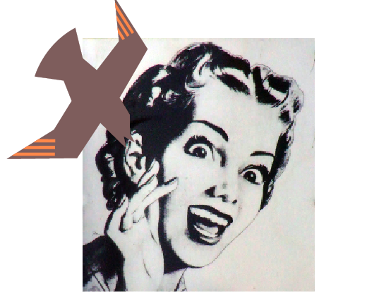
The bird would represent her being trapped, or controled
The cloud would represent a conflict in the home
The poisoned apple with the worm in it would represent her being neglected
And finally the ant would represent her worshiping her fellow companion.
I wanted to add a point of irony to the idea of this exhibit. Having soft nice tones with negative things said about women, in such a sarcastic tone.
This was the next step of exploring three different ways with our idea. I still kept the the picnic idea, but using words represent actions that might happen within a problematic picnic (I didn't find this as interesting, maybe because I was bit burned out by the idea, but also on how much I explored the idea of the feminist one) After looking at everything it came to the decision of going with the idea of pattern and word with the mother's prerogative. Which I was happy with, because the idea of having image, word, and pattern was a lot to handle to make look cohesive as a set.
After this crit there was still some corrections to be made:
And here we are now, I'm still making some tweaks here and there. I know I had a lot of trouble with how I dealt with the type within the title and Smithsonian logo, but hopefully I've battled it out enough.
A mother's prerogative came through my final icon set related to a problematic picnic. Going through one day working with Julie, we presented our icon set with words and images either relaying the message, or anchoring the message of the icon. I had one of my icon's, the attacking bird, with the word mother, which I feel is relaying the message of an attacking bird. So, this got me thinking, could I use the other icons in my set to send a relaying message from each of my icons. It took some more brainstorming to hammer the ideas out for each of my icons. I several different ideas, and a lot of them were leading up to a feminist idea of how the man can control the women, or how the stereotypical women is "supposed" to react to the stereotypical man. Such as the ants representing worshiping:
This idea lead to many more, but in the end the whole image with pattern, and showing the different women became inconsistent and then led me to the idea of just using one word with a pattern I had previously made, or remade for the idea.
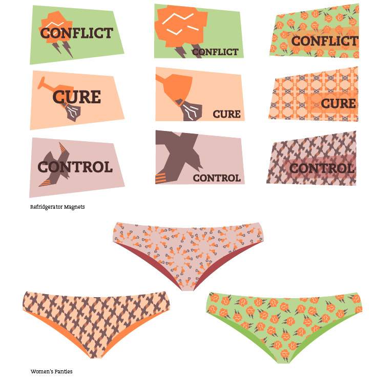
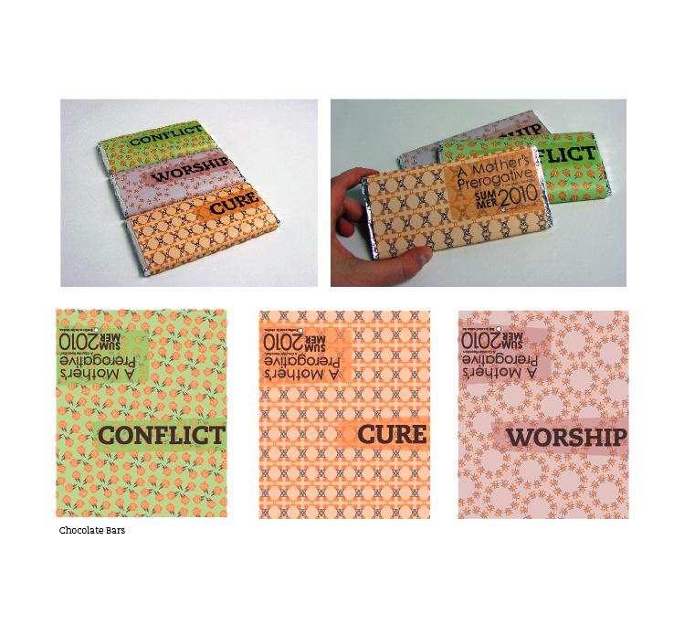
I ended up using five out of seven icons to represent the mother's prerogative museum exhibit, and then paired them with five different words.
Ant=Worship
Bird=trapped and control
Wine glass= relief and cure
storm cloud=conflict
poisoned apple=neglect
I felt that all of these words and icons could relate back to how the wife was treated by her husband, or how possibly the mother could be treated by her kids, or how she could treat her kids.
I kept with my final icon color palette, but also by warming them up just a little to make them more cohesive as a set. Here the final product is. (I still have some revisions to make though)
YAY!
For the corrections to be made were to deal with the time based elements better than I am. Spread them across the board better, and to also fix the type again. Spread it out as well!
Coming to the end of the last project in image class which was the six degrees project. It was fun, and interesting to have an issue brought to you, that you then had to solve with a partner. Which was the first time we all had to deal with having partners in the design department all the way through a project. It was nice not having the entire ordeal on your shoulders but we definitely had to deal with how each partner worked, and seeing how we could bring both of our aesthetics to the idea. Over all I liked working with Kelsey a lot, we have different views on the issue, but with putting it aside and concentrating on the project was number one.
Working through our idea and trying to make it not so boring, and bringing all the elements we wanted to show with the project together really came together the last week or so by adding the elements that we had in the inside of our dvd cover to the outside, and while adding the outside to the inside.
Looking back through all of the projects I have done these past two semesters I've seen it's definitely been a trip. A trip of improvement, a trip of brain farts, and a trip of mistakes. For my final review I've listed things down for the past couple weeks thinking about what I'd like to show and to show how they connect together. My list of pieces to showcase:
Dot book (to show how I can deal with type and image together)
Line book (juxtaposing, showing process!)
Haiku animation and taxonomy
Icon set (showing all steps to coming to the final color icons)
Museum Exhibit- along with my mock ups of the candy bars and post cards. ( to show how I can use some slight contradictions with color and words.)
Info graphics within Magazine spreads
Monogram and book layouts (to show improvement to my magazine layouts)
Change one thing poster (show the process of this, because I thought the evolution of this project was quite a long one for me)
Bus wrap for the weather project (probably not my billboard) (and maybe my animation I did)
Gail Anderson Poster
Seven Deadly sins project/book
6 degress project and possibly adding in my 'nice to meet you' picture to add some personal flare.
Color theory book (different color fabrics) (to show how I can see and identify color, and be connected to all projects really, due to the way we deal with color now)
Building and initial pen tool exercises (to show where I started with the pen tool and measurements)
I also was interested in adding something I designed in my last semester fiber class.
I thought it'd be nice to show how I'm interested in using fabric and how i could use design outside of class.
The other stuff I wasn't sure about to show or now was:
Patriots and Poppies animation that we did for type 1
hand drawn perfect letter we did type 1
For now, I think having only 5 minutes to showcase my work will be difficult, but I definitely want to touch on my museum exhibit identity, magazine layouts, dot book, six degrees, Gail Anderson, and haiku.
I also think that showing how I transformed my icon set to relay to something else than what they were meant to be would be a good thing to touch on.