Design is all about improvement, and within these readings you could tell that making communications with sources is a very important subject to improve as much as possible. Communication skills involve knowing and applying the codes grammar, knowing and using a broad vocabulary, knowing and applying the conventions, and adapting the use of your code to your audience. Within this list, I thought it was interesting because this embodies so many things. The source can apply to sender and receiver, because they are both having the "dialogue", so each thing that the source initiates the receiver needs to react to. Communication skills affect our ability to analyze our own purposes and intentions. It also affect our ability to encode message which say what we intend.
"The words we put together and how we command them affect what we think about, how we think and whether we are thinking at all." This point was interesting to me, because it questions the entire system. Which is what we as designers are suppose to do. We are supposed to question systematic things. The part about the levels A, B, C I think expressed this well, by writing certain questions we may ask within redesigning this initial communication model.
Breaking the model up into pieces you get, Source/receiver, Message, and Channel.
The source can be developed into different levels that one needs to look at when trying to communicate. The Knowledge Level, which looks at the way attitudes may vary, or how one can produce or treat messages, also the kind of choices one makes with a message, and of course subject matter.
The next level is called the socio-cultural level which concentrates on the way each different social class may communicate. I.E- The word choices one makes, the purposes for communicating, the meanings they attach to certain words, their choice of receivers and the channels they use to relay that message.
The next level is the attitude source which concentrates more on how the specific person or thing is creating this message. It's all about how it's done. Such as with confidence, or attitude towards one self, the attitude towards the subject matter, and the attitude towards the receiver.
The Message is all about the code, content and the treatment of the message.
When encoding a message we must make a certain decisions about the code we will use. The content is the way you choose to arrange the structure of the message, the then the treatment is all about the journey and the medium of the message. So if you make it have a certain treatment that fits into an idea, it needs to got through the communication system/model successfully with the right treatment.
The Channel is how the message is going to go through. What source will it travel through, the internet, the phone line, the mail Etc.
What is available? How much money can be spent? What is a popular line of channel? What would be the most effective?.
I feel that in making a communication channel, there has to has to has to be a ton of research involved with how and where and whatever else to make a it successful.

Sunday, October 31, 2010
Saturday, October 30, 2010
Test

Pathos(below)


The mode Ethos is the mode that is supposed to entice the audience by tying something important and note-worthy to the message. Such as in my initial sketches for Johnson and Johnson Band-aids I showed that using the idea of the red-cross, and that it being the number one band-aid in America, made this brand seem like it'd be the best, because of what is behind (backing them up) them. I also used the idea of a blue ribbon to show the idea of them being number one as well.
The mode Pathos is the mode that is suppose to entice the audience by relating to them, trying to "touch" their heart, you could say. It could be the type of mode it's trying to portray, or it could be that takes you to another place. (example: grandma's house) I first started practicing pathos on band-aids with showing the idea of how painful it is to get hurt, and saying band-aid could help that. Also by showing antithesis with how band-aids cover up cuts, and they "beat" sharp objects.
The mode Logos is the mode that is supposed to entice the audience by being matter-of-fact. Either with their imagery, or with their words on the package. For example, if you are a buyer in the store who wants something quick, and wants to know what is in what you're buying, you will probably be more attracted to things that are more simple in imagery and type. It could also be instructional. I remember one of examples for band-aids was having the box being a "pull-tab" and having instructions to show how to get the box open that way, but we were concerned it was too logos rather than pathos.
Note: Logos, was probably my hardest mode to get right, I suppose I just didn't grasp the concept as well as I did the other two. Now, though, looking around at different packaging it's coming a lot easier, and I'm more aware of it now.
Final Modes of Appeal Packaging

Here we have the original package with my two new, pathos, and ethos packaging.


Monday, October 25, 2010
Vis Lang: Pathos and Ethos Series


NA: Content Outline
Seeing that "ditto" is a online based company, and community I thought that yes, the internet is now very well known, but every website is different in how they approach buying and selling product. Thinking through some initial ideas of maybe making an interface to have the base of what it may look like, so the user could have an experience. Talking to Tyler about this idea though, he expressed that keeping that idea in mind for the last project, because he wanted this project to be more of a designer-based linear narrative, rather than user-based non-linear narrative.
So, I went with my back-up plan of user experience. Which I'm excited about. I've been looking online at a lot of "how-to" videos, some more expressive than other, and it's interested to see how each are different with how they have their step-by-step process. Some have 10 steps, others have 3.
This brought to my attention of how long I should spend explaining this process. I've pretty much gotten down what my content is:
Introduction
Step One: Browse
Step Two: Choose
Step Three: Order/Purchase
Step Four: Wait around for approximately 7-10 business days.
Step Five: Receive fabric in the mail!
Step Six: Make something! Be creative.
Step Seven: Take some pictures of what you made
Step Eight: Upload and share on our website what you made!
Now, just so you know, I was intentionally being very nit-picky about the step you take (I could have probably added much more). There is obviously too much detail, and some steps are just obvious and arbitrary. So, fitting everything in the right category so that I could mesh two or three steps into one large step I thought would help the process speed up, and be boring.
This is what I ended up with
Introduction!
Step One: Browse, choose, order/purchase
Step Two: Wait for approximately 7-10 business days, and receive in the mail!
Step Three: Make something!
Step Four: Upload and share online
I figured I could possibly make into three steps by combining step three and four, but thought each deserved their own.
Now moving on to the actual content about what each will say and express is a different step.
Friday, October 22, 2010
Pathos and Ethos: Progress
Moving forward with this project we now pick one idea for each mode of appeal. My two different packages for ethos and pathos will continue as a series, rather than being two different ideas. Using the same rendering style, and typography will help make this idea come across, and having the boxes be 45 assorted band-aids, and the other being one size will also help showing them on the shelf next to each other better. It was said though, that the color scheme needs to be blue, red, white, and one other color, so I'll be exploring what other color that may be. I need to go back to my roots with color theory, and just base it off of certain color ways.
Final Pathos direction:
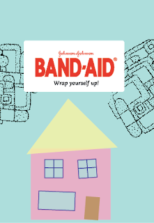
 Using the house to show family, and that you should protect your family with say, "bubble wrap" is to say you should use band-aids to protect yourself. I'll be wrapping the package p with bubble wrap, and increasing the size of the type to be able to show through the pattern on the bubble wrap. Also, doing a lot of fun little drawings will be within my process as well. I'm taking out the pattern, because it was just too busy with other illustrations besides the main one.
Final ethos direction:
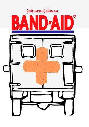
 Adding more detail to this ambulance I think will help a lot. Also, making the band-aids bigger on the back of the ambulance will also show more of the band-aid (which is important). The type on this one is working a lot better than having it smaller, such as in my previous image, because it bold, and big. And on such a tiny package, that's also important to have.
Other Ideas for Pathos:


 NOTE: These would all be behind the bubble wrap.
Other directions for Ethos:

 My drop shadow skills used to be better....hah
Jamie thought the photographic approach just wasn't working as well as the illustrative approach.
Final Pathos direction:

Final ethos direction:
Other Ideas for Pathos:


Other directions for Ethos:

Jamie thought the photographic approach just wasn't working as well as the illustrative approach.
Thursday, October 21, 2010
Wednesday, October 20, 2010


Type 3: Koenig Layouts


The type faces I'm working with are Caecilia, and Franklin Gothic.
I'm also wanting to add some graphic elements through the entire layouts.
Now for this week!


-Make the graphic boxes mean something, and not make them default device.
-Work with less change in column width. Try and stay within an idea, and tweak it nicely, and slightly. -Not a huge jump.
-Stay consistent!
-Overlaying text is a good idea, make legible.
-Mimic the way I use the images within my text
Due to amount of content I plan on rearranging my book to have sections of different dates, so it will have an opening page to each section of dates, then have the houses, or buildings within that section. It was nice to see and hear the lecture today, because it made me thinking about all the other things I can add to my layouts, such as graphic elements, and the idea of working with a grid not on a grid.
Tuesday, October 19, 2010
PATTERNS!
Just working on finishing up my first series of patterns for my Direct Study, I'm doing in Fiber. I'm doing a series dealing with wood type. Three will be hand printed, while the others will be digitally printed.


Still not sure on what my color pallet will be, but it's a gettin' there.


Still not sure on what my color pallet will be, but it's a gettin' there.
Monday, October 18, 2010
Ethos: Band-aid First mock ups


NOTES from group crit:
-Be careful of the logo and the image, give more space for them to breathe.
-Type set the "#1" instead of the hand render.
-Integrate the number one better as well. (drop shadow?)
-Simplify drawing
-Use drawing instead of image
-Play with background colors.
-Still use red and blue (good color combo)
Subscribe to:
Posts (Atom)